这是一个 Vux 的官方文档的学习笔记,目的是学习使用Vux的各个组件,该文章主要是官方文档的知识的记录,用于回顾与练习使用VuxUI组件库;
VuxUI 组件库学习笔记
Vux 官方网站文档
1. 指令 Directives
1.1 v-transfer-dom 指令
1.1.1 指令功能
增加一个 div 包含 v-transfer-dom ,实现自动移动到 body 下,解决 z-index 失效等问题;
1.1.2 使用方式
a. 注册局部指令:
1
2
3
4
5
6
| import { TransferDom } from 'vux'
export default {
directives: {
TransferDom
}
}
|
b. 注册全局指令
1
2
| import { TransferDom } from 'vux'
Vue.directive('transfer-dom', TransferDom)
|
1.1.3 具体模板使用
1
2
3
| <div v-transfer-dom>
<popup v-model="show"></popup>
<div>
|
2.1 base64
2.1.1 base64组件的功能
用于base64编码和解码,例如将图片进行base64编码;
2.1.2 base64组件的导入与使用
1
2
3
| import { base64 } from 'vux'
base64.encode('VUX')
base64.decode('VlVY')
|
2.2 cookie(略)
2.3 日期格式化
2.3.1 日期格式化组件的功能
在代码中进行日期时间的格式化;
2.3.2 日期格式化组件的使用
- 直接使用
1
2
| import { dateFormat } from 'vux'
dateFormat(new Date(), 'YYYY-MM-DD HH:mm:ss')
|
- 作为
filter过滤器使用1
2
3
4
5
6
| import { dateFormat } from 'vux'
export default {
filters: {
dateFormat
}
}
|
2.4 debounce
请注意了解 debounce 和 throttle 的区别
2.4.1 debounce 组件的使用
详细文档
1
2
| import { debounce } from 'vux'
debounce(func, [wait=0], [options={}])
|
2.4.2 throttle 组件的使用
详细文档
1
2
| import { throttle } from 'vux'
throttle(func, [wait=0], [options={}])
|
2.5 md5 加密
该工具直接依赖于 blueimp-md5
注意: md5是消息摘要算法并非加密算法,用于需要加密的场景会有安全问题。
2.5.1 md5 组件的使用
1
2
| import { md5 } from 'vux'
md5('VUX')
|
2.6 number 格式化工具
2.6.1 number 格式化工具的功能
numberComma用于分割数字,默认为3位分割,一般用于格式化金额;numberPad用于按照位数补0;numberRandom用于生成两个整数范围内的随机整数;
2.6.2 number 格式化工具的使用
1
2
3
4
5
6
7
8
| import { numberComma, numberPad, numberRandom } from 'vux'
numberComma(21342132)
numberComma(21342132, 4)
numberComma(21342132.234)
numberPad(1)
numberPad(234, 4)
numberRandom(1, 7)
|
2.7 url 参数解析
用于解析请求的url参数中的query字段为一个对象;
2.7.1 url 参数解析组件的使用
1
2
3
| import { querystring } from 'vux'
querystring.parse('a=b&c=d')
querystring.stringify({a:'b',c:'d'})
|
2.8 string 处理工具
2.8.1 string 处理工具trim组件(去除空格)的使用
1
2
| import { trim } from 'vux'
trim(' 1024 ')
|
3. 基础组件
3.1 icon 图标
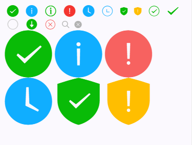
3.1.1 icon图标组件的功能
在小图标的使用中会用到该组件,直接可以作为一个行内元素使用,icon图标默认为小型图标(23px),加上is-msg为中等图标(93px);
3.1.2 icon图标组件注册
- a. 局部组件
1
2
3
4
5
6
| import { Icon } from 'vux'
export default {
components: {
Icon
}
}
|
- b. 全局组件
1
2
3
4
|
import Vue from 'vue'
import { Icon } from 'vux'
Vue.component('icon', Icon)
|
3.1.3 icon图标类型使用
1
2
3
4
5
6
7
8
9
10
11
12
13
14
15
16
17
18
19
20
21
22
| <icon type="success"></icon>
<icon type="info"></icon>
<icon type="info-circle"></icon>
<icon type="warn"></icon>
<icon type="waiting"></icon>
<icon type="waiting-circle"></icon>
<icon type="safe-success"></icon>
<icon type="safe_warn"></icon>
<icon type="success-circle"></icon>
<icon type="success-no-circle"></icon>
<icon type="circle"></icon>
<icon type="download"></icon>
<icon type="cancel"></icon>
<icon type="search"></icon>
<icon type="clear"></icon>
<br/>
<icon type="success" is-msg></icon>
<icon type="info" is-msg></icon>
<icon type="warn" is-msg></icon>
<icon type="waiting" is-msg></icon>
<icon type="safe_success" is-msg></icon>
<icon type="safe_warn" is-msg></icon>
|
3.2 x-icon 小图标
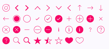
3.2.1 x-icon图标组件的功能
x-icon 是一个虚拟(占位)组件,你不需要引入XIcon 组件,当调用时vux-loader@^1.0.43会自动将转换成 inline svg。
3.2.2 x-icon图标的属性和样式变量
| x-icon属性名字 |
类型 |
默认值 |
说明 |
| type |
string |
|
图标名字 |
| size |
string |
24 |
尺寸大小 |
x-icon样式变量名字 | 默认值
— | — | —
@icon-success-color | 紫红色#09BB07
3.2.3 x-icon图标类型使用
1
2
3
4
5
6
7
8
9
10
11
12
13
14
15
16
17
18
19
20
21
22
23
24
25
26
27
28
29
30
31
32
33
34
35
36
37
38
| <x-icon type="ios-ionic-outline" size="30"></x-icon>
<x-icon type="ios-arrow-back" size="30"></x-icon>
<x-icon type="ios-arrow-forward" size="30"></x-icon>
<x-icon type="ios-arrow-up" size="30"></x-icon>
<x-icon type="ios-arrow-right" size="30"></x-icon>
<x-icon type="ios-arrow-down" size="30"></x-icon>
<x-icon type="ios-arrow-left" size="30"></x-icon>
<x-icon type="ios-arrow-thin-up" size="30"></x-icon>
<x-icon type="ios-arrow-thin-right" size="30"></x-icon>
<x-icon type="ios-arrow-thin-down" size="30"></x-icon>
<x-icon type="ios-arrow-thin-left" size="30"></x-icon>
<x-icon type="ios-circle-filled" size="30"></x-icon>
<x-icon type="ios-circle-outline" size="30"></x-icon>
<x-icon type="ios-checkmark-empty" size="30"></x-icon>
<x-icon type="ios-checkmark-outline" size="30"></x-icon>
<x-icon type="ios-checkmark" size="30"></x-icon>
<x-icon type="ios-plus-empty" size="30"></x-icon>
<x-icon type="ios-plus-outline" size="30"></x-icon>
<x-icon type="ios-plus" size="30"></x-icon>
<x-icon type="ios-close-empty" size="30"></x-icon>
<x-icon type="ios-close-outline" size="30"></x-icon>
<x-icon type="ios-close" size="30"></x-icon>
<x-icon type="ios-minus-empty" size="30"></x-icon>
<x-icon type="ios-minus-outline" size="30"></x-icon>
<x-icon type="ios-minus" size="30"></x-icon>
<x-icon type="ios-information-empty" size="30"></x-icon>
<x-icon type="ios-information-outline" size="30"></x-icon>
<x-icon type="ios-information" size="30"></x-icon>
<x-icon type="ios-help-empty" size="30"></x-icon>
<x-icon type="ios-help-outline" size="30"></x-icon>
<x-icon type="ios-help" size="30"></x-icon>
<x-icon type="ios-search" size="30"></x-icon>
<x-icon type="ios-search-strong" size="30"></x-icon>
<x-icon type="ios-star" size="30"></x-icon>
<x-icon type="ios-star-half" size="30"></x-icon>
<x-icon type="ios-star-outline" size="30"></x-icon>
<x-icon type="ios-heart" size="30"></x-icon>
<x-icon type="ios-heart-outline" size="30"></x-icon>
|
x-button 组件的功能是作为按钮的功能,例如提交按钮;x-button 按钮默认是正常类型(填充整个行空间——可以结合弹性布局使用),可以设置为小型按钮(mini),设置按钮的类型(type= "default/primary/warn"),是否有背景色(plain),设置加载图标(show-loading),设置图标不可点击(disabled),按钮的背景渐变色(:gradients="['#0184D0', '#33ACFB']");
| x-button属性名字 |
类型 |
默认值 |
说明 |
| type |
string |
default |
按钮类型,可选值为 default,primary,warn |
| disabled |
boolean |
false |
是否不可点击 |
| text |
string |
|
按钮文字,同默认slot |
| mini |
boolean |
false |
是否为mini类型,即小尺寸的按钮 |
| plain |
boolean |
false |
是否是plain样式,没有背景色 |
| action-type |
string |
|
button的type属性,默认为浏览器默认(submit),可选为 submit button reset |
| link |
string |
|
vue-router 路由, 值为 BACK 等同于 go(-1) |
| show-loading |
boolean |
false |
显示加载图标 |
| gradients |
array |
|
按钮背景渐变,长度必须为2 |
| x-button插槽名字 |
说明 |
| 默认插槽 |
按钮文字 |
| x-button样式变量名字 |
默认值 |
说明 |
| @button-global-border-radius |
5px |
圆角边框 |
| @button-global-font-color |
#FFFFFF |
字体颜色 |
| @button-global-margin-top |
15px |
与相邻按钮的 margin-top 间隙,只有一个按钮时不生效 |
| @button-global-height |
42px |
按钮高度 |
| @button-global-disabled-font-color |
rgba(255,255,255,.6) |
disabled状态下的字体颜色 |
| @button-global-active-font-color |
rgba(255,255,255,.6) |
disabled状态下的字体颜色 |
| @button-global-font-size |
18px |
字体大小 |
| @button-mini-font-size |
13px |
mini类型的字体大小 |
| @button-mini-line-height |
2.3 |
mini类型的行高 |
| @button-warn-bg-color |
#E64340 |
warn类型的背景颜色 |
| @button-warn-active-color |
#CE3C39 |
active状态下,warn类型的背景颜色 |
| @button-warn-disabled-bg-color |
#EC8B89 |
disabled状态下,warn类型的背景颜色 |
| @button-default-bg-color |
#F8F8F8 |
default类型的背景颜色 |
| @button-default-font-color |
#000000 |
default类型的字体颜色 |
| @button-default-active-bg-color |
#DEDEDE |
active状态下,default类型的背景颜色 |
| @button-default-disabled-font-color |
rgba(0,0,0,.3) |
disabled状态下,default类型的字体颜色 |
| @button-default-disabled-bg-color |
#F7F7F7 |
disabled状态下,default类型的背景颜色 |
| @button-default-active-font-color |
rgba(0,0,0,.6) |
active状态下,default类型的字体颜色 |
| @button-primary-bg-color |
#1AAD19 |
primary类型的背景颜色 |
| @button-primary-active-bg-color |
#179B16 |
active状态下,primary类型的背景颜色 |
| @button-primary-disabled-bg-color |
#9ED99D |
disabled状态下,primary类型的背景颜色 |
| @button-plain-primary-color |
rgba(26,173,25,1) |
plain的primary类型的字体颜色 |
| @button-plain-primary-border-color |
rgba(26,173,25,1) |
plain的primary类型的边框颜色 |
| @button-plain-primary-active-color |
rgba(26,173,25,.6) |
active状态下,plain的primary类型的字体颜色 |
| @button-plain-primary-active-border-color |
rgba(26,173,25,.6) |
active状态下,plain的primary类型的边框颜色 |
| @button-plain-default-color |
rgba(53,53,53,1) |
plain的default类型的字体颜色 |
| @button-plain-default-border-color |
rgba(53,53,53,1) |
plain的default类型的边框颜色 |
| @button-plain-default-active-color |
rgba(53,53,53,.6) |
active状态下,plain的default类型的字体颜色 |
| @button-plain-default-active-border-color |
rgba(53,53,53,.6) |
active状态下,plain的default类型的边框颜色 |
| @button-plain-warn-color |
rgba(206,60,57,1) |
plain的warn类型的字体颜色 |
| @button-plain-warn-border-color |
rgba(206,60,57,1) |
plain的warn类型的边框颜色 |
| @button-plain-warn-active-color |
rgba(206,60,57,.6) |
active状态下,plain的warn类型的字体颜色 |
| @button-plain-warn-active-border-color |
rgba(206,60,57,.6) |
active状态下,plain的warn类型的边框颜色 |
- a. 局部注册
1
2
3
4
5
6
| import { XButton } from 'vux'
export default {
components: {
XButton
}
}
|
- b. 全局注册
1
2
3
4
|
import Vue from 'vue'
import { XButton } from 'vux'
Vue.component('x-button', XButton)
|
1
2
3
4
5
6
7
8
9
10
11
12
13
| <x-button
type="primary/default/warn" 按钮颜色类型
action-type="submit/button/reset " 按钮type属性
link="/demo" 链接,vue-router 路由
text="按钮文字" 和slot插槽功能相同,可以使用v-bind绑定变量数据
mini 设置为小型按钮
plain 设置按钮无背景颜色
show-loading 按钮显示加载中的图标,可以使用v-bind绑定变量数据(值为true或false)
disabled 设置按钮不可点击,可以使用v-bind绑定变量数据(值为true或false)
:gradients="['#1D62F0', '#19D5FD']" 设置按钮背景渐变色
>
primary
</x-button>
|
4. 布局组件
4.1 divider 分割线
4.1.1 divider组件的功能
实现类似于HTML中的<hr>标签的功能,作为分割线使用;
4.1.2 divider组件的插槽
| divider插槽名字 |
说明类型 |
| 默认插槽 |
分隔线标题 |
4.1.3 divider组件注册
- a. 局部注册
1
2
3
4
5
6
| import { Divider } from 'vux'
export default {
components: {
Divider
}
}
|
- b. 全局注册
1
2
3
4
|
import Vue from 'vue'
import { Divider } from 'vux'
Vue.component('divider', Divider)
|
4.1.4 divider组件的使用
1
| <divider>我是分割线</divider>
|
4.2 flexbox 弹性布局(子元素:flexbox-item )
4.2.1 flexbox 弹性布局组件的功能
flexbox 弹性布局组件用于实现页面的弹性布局,其子元素为 flexbox-item 组件;
4.2.2 flexbox/flexbox-item 弹性布局组件的属性和插槽
| flexbox 属性名字 |
类型 |
默认值 |
说明 |
| gutter |
number |
8 |
间隙像素大小(px) |
| orient |
string |
horizontal |
排布方向,可选['horizontal', 'vertical'] |
| justify |
string |
|
flex的justify-content属性,定义了在主轴上的对齐方式,可选参数:`flex-start(默认值,左对齐) |
| align |
string |
|
flex的align-items属性,项目在交叉轴上如何对齐,可选参数:`flex-start(交叉轴的起点对齐) |
| wrap |
string |
|
flex的flex-wrap属性,决定换行方式,可选参数:`nowrap(默认值,不换行) |
| direction |
string |
|
flex的flex-direction属性,决定主轴的方向(即为排列方向),可选参数:`row(默认值,从左到右) |
| flexbox插槽名字 |
说明 |
| 默认插槽 |
flexbox-item 的内容插槽 |
| flexbox-item 属性名字 |
类型 |
默认值 |
说明 |
| span |
number |
|
占用宽度,如果不设置,所有flexbox-item将平分 |
| order |
string |
|
flex的order属性,定义项目的排列顺序,其中数值越小,排列越靠前,默认为0。 |
| flexbox-item 插槽名字 |
说明 |
| 默认插槽 |
内容插槽 |
4.2.3 flexbox/flexbox-item 弹性布局的组件的注册
a. 局部注册
1
2
3
4
5
6
7
| import { Flexbox, FlexboxItem } from 'vux'
export default {
components: {
Flexbox,
FlexboxItem
}
}
|
b. 全局注册
1
2
3
4
5
|
import Vue from 'vue'
import { Flexbox, FlexboxItem } from 'vux'
Vue.component('flexbox', Flexbox)
Vue.component('flexbox-item', FlexboxItem)
|
4.2.4 flexbox 弹性布局的组件的使用
1
2
3
4
5
6
7
8
9
10
11
| <flexbox
:gutter="0" 设置间隙的像素大小
orient="horizontal(默认)/vertical" 设置排布方向
wrap="wrap" 设置换行方式, 参数为:nowrap(默认值,不换行) | wrap(换行,第一行在上方) | wrap-reverse(换行,第一行在下方)
>
<flexbox-item
:span="4" 设置占用的宽度,默认一行有12格,也可以使用分数表示
:order="-99" 设置其排列顺序,数字越小越靠前,默认为0
><div class="flex-demo">1</div></flexbox-item>
<flexbox-item><div class="flex-demo">2</div></flexbox-item>
</flexbox>
|
4.3 grid 栅格布局(子元素 grid-item)
4.3.1 grid 栅格布局的功能
grid 组件用于栅格布局的盒子,例如构建一个九宫格的框架,包含图片和文字类容,其中 grid-item 为内容插槽,用于填充其内容;
4.3.2 grid/grid-item 组件的属性和插槽
| grid 属性名字 |
类型 |
默认值 |
说明 |
| rows |
number |
3 |
(v2.6.0 之后废弃,使用 col 替代)宫格行数,建议少于5 |
| cols |
number |
3 |
列数。如果为非单行 Grid,需要设置 cols,否则所有 GridItem 会平均宽度显示在一行。 |
| show-lr-borders |
boolean |
true |
是否显示左右边框 |
| show-vertical-dividers |
boolean |
true |
是否显示垂直分割线 |
| grid 插槽名字 |
说明 |
| 默认插槽 |
grid-item 的内容插槽 |
grid-item 属性名字 | 类型 | 默认值
— | — | — | —
icon | string | 图标地址,如果是线上地址,推荐使用该prop。如果是本地图标资源,使用slot=icon可以保证资源被正确打包
label | string | label 文字
link | string | vue-router 路径
| grid-item 插槽名字 |
说明 |
| icon |
图标内容,直接使用img标签 |
| label |
label 文字的 slot,作用同 prop:label |
4.3.3 grid/grid-item 组件的注册
- a. 局部注册
1
2
3
4
5
6
7
| import { Grid, GridItem } from 'vux'
export default {
components: {
Grid,
GridItem
}
}
|
- b. 全局注册
1
2
3
4
5
|
import Vue from 'vue'
import { Grid, GridItem } from 'vux'
Vue.component('grid', Grid)
Vue.component('grid-item', GridItem)
|
4.3.4 grid/grid-item 组件的使用
1
2
3
4
5
6
7
8
9
10
11
12
13
14
15
16
17
18
19
20
21
| <grid
:cols="3" 设置宫格的列数
:show-lr-borders="false" 设置不显示左右边框,默认为显示
:show-vertical-dividers="false" 设置不显示垂直分割线,默认为显示
>
<grid-item
label="" 在此设置宫格中的文字内容,与内容插槽中使用一致
icon= "" 在此设置宫格中的图片内容,与内容插槽中使用一致
link="/component/cell" 设置`vue-router` 路径
v-for="i in 2"
:key="i"
>
<img
slot="icon" 插槽图标内容,直接使用img标签
src="../assets/grid_icon.png" 图片地址
>
<span
slot="label" 插槽文字内容,作用同 `prop:label`
>跳转</span>
</grid-item>
</grid>
|
4.4 sticky 滚动固定
4.4.1 sticky 滚动固定组件的功能
sticky 滚动固定组件用于在页面滚动后,达到某一个值后将sticky 滚动固定组件的内容固定在该位置,起到悬浮的功能;
4.4.2 sticky 滚动固定组件的属性、插槽、方法和样式变量
| sticky 组件属性名字 |
类型 |
默认值 |
说明 |
| scroll-box |
string |
window |
滚动容器,默认为window,如果你使用了viewbox,那么你需要指定容器id:vux_view_box_body |
| check-sticky-support |
boolean |
true |
是否检测当前浏览器是否支持sticky特性,禁用则在iPhone设置上也使用scroll实现 |
| offset |
number |
0 |
距离顶部高度,在存在头部(如使用了x-header)的情况下需要设置一个距离 |
| disabled |
boolean |
false |
是否禁用,在某些浏览器禁用,比如万恶的 UC |
| sticky 组件插槽名字 |
说明 |
默认插槽 |
内容插槽 |
| sticky 组件方法名字 |
参数 |
说明 |
| bindSticky |
|
手动重新绑定,用于内容变化导致位置变化定位不再正确的情况 |
| sticky 组件样式变量名字 |
默认值 |
说明 |
| @sticky-zindex |
500 |
|
4.4.3 sticky 组件的注册
- a. 局部注册
1
2
3
4
5
6
| import { Sticky } from 'vux'
export default {
components: {
Sticky
}
}
|
- b. 全局注册
1
2
3
4
| // 在入口文件全局引入
import Vue from 'vue'
import { Sticky } from 'vux'
Vue.component('sticky', Sticky)
|
4.4.4 sticky 组件的使用
1
2
3
4
5
6
7
8
9
10
11
12
| <div style="height:44px;"> 建议加一个div高度为内容高度,这样可以避免当定位为sticky时下面的元素会突然向上走
<sticky
scroll-box="vux_view_box_body" 设置滚动的指定容器,vux_view_box_body 表示为 view-box 组件生成的内容区域的容器
ref="sticky" 设置ref属性
:offset="46" 设置距离顶部高度,在存在头部(如使用了`x-header`)的情况下需要设置一个距离
:check-sticky-support="false" 可以通过设置禁用原生支持检测以获得相同的效果
:disabled="disabled" 设置禁用属性,可以根据不同浏览器设置禁用
>he
<div>我是滚动到一定位置需要固定的内容</div>
</sticky>
</div>
<p v-for="i in 100">{{i}}<br></p> 用于内容区域填充
|
4.5 view-box 滚动容器
4.5.1 view-box 滚动容器组件的功能
view-box 滚动容器组件是用于设置页面的滚动的盒子,可以设置为全局滚动以及某个div中内容的局部滚动,注意一点的是由于该组件为100%高布局,因此必须设置view-box所有父div也需要为100%高度;若想保存滚动距离,推荐使用vuex实现,在特定path对scrollBody监听scroll事件,并获取滚动距离保存到vuex的state里;
4.5.2 view-box 组件的属性、插槽、方法
| view-box属性名字 |
类型 |
默认值 |
说明 |
| body-padding-top |
string |
|
主体的padding-top值,当顶部存在x-header等absolute定位元素时需要设置 |
| body-padding-bottom |
string |
|
主体的padding-bottom值,当底部存在tabbar等absolute定位元素时需要设置 |
| 插槽名字 |
说明 |
| header |
顶部区域,如果要使用统一的 XHeader,可以使用该slot |
| 默认插槽 |
主体内容,可滚动的区域 |
| bottom |
底部区域,Tabbar 可以使用该 slot |
| view-box方法名字 |
参数 |
说明 |
| scrollTo |
(top) |
滚动到指定位置 |
| getScrollTop |
|
获取当前滚动距离 |
| getScrollBody |
|
获取滚动 div, 也可以直接用组件引用的 .$refs.viewBoxBody |
4.5.3 view-box 组件的注册
- a. 局部注册
1
2
3
4
5
6
| import { ViewBox } from 'vux'
export default {
components: {
ViewBox
}
}
|
- b. 全局注册
1
2
3
4
| // 在入口文件全局引入
import Vue from 'vue'
import { ViewBox } from 'vux'
Vue.component('view-box', ViewBox)
|
4.5.4 view-box 组件的使用
在viewBox里元素定位为absolute,效果等同于fixed,若整个页面使用,需要设置 html, body 高为100%:
1
2
3
4
5
| html, body {
height: 100%;
width: 100%;
overflow-x: hidden;
}
|
若局部滚动使用,view-box所有父div也需要为100%高度:
1
2
3
4
5
6
7
8
9
10
11
12
13
14
15
16
| <div style="height:100%;">
<view-box
ref="viewBox" 用于后面通过refs属性获取该元素对象
body-padding-top= "88px" 设置主体的`padding-top`值,当顶部存在`x-header`等`absolute定位元素`时需要设置
body-padding-bottom= "44px" 设置主体的`padding-bottom`值,当底部存在`tabbar`等`absolute定位元素`时需要设置
>
<x-header
slot="header" 使用插槽设置滚动区域的顶部区域
style="width:100%;position:absolute;left:0;top:0;z-index:100;"
></x-header>
<router-view></router-view> 用于路由填坑
<tabbar
slot="bottom" 使用插槽设置滚动区域的底部区域
></tabbar>
</view-box>
</div>
|
5. 表单组件
5.1 calendar(日历)
5.1.1 calendar组件的功能
calendar组件作为日历的组件使用,同时calendar只能在Group中使用,除了title和 value, 其他props和inline-calendar完全一致;当绑定值为数组时,日历将为多选模式;
5.1.2 calendar组件的属性、事件、插槽和样式变量
| calendar组件的属性名字 |
类型 |
默认值 |
说明 |
| value |
string |
|
表单值, v-model 绑定。当值为空时,为单选;当值为[]时,为多选;设置值为'TODAY'可快捷选取当前日期。placeholder只有在值为空或[]时显示。 |
| title |
string |
|
label文字 |
| placeholder |
string |
|
占位提示文字 |
| show-popup-header |
boolean |
|
是否显示弹窗头部,当为多选时强制显示,单选时默认不显示 |
| popup-header-title |
string |
|
弹窗头部文字 |
| display-format |
function |
|
格式化显示值 |
| readonly |
string |
|
是否禁用弹窗选择 |
| calendar组件的事件名字 |
参数 |
说明 |
| @on-change |
(value) |
值改变时触发 |
| @on-show |
– |
弹窗显示时触发 |
| @on-hide |
– |
弹窗关闭时触发 |
| calendar组件的样式变量名字 |
默认值 |
说明 |
| @calendar-arrow-color |
草绿色#04BE02 |
前进后退的箭头颜色 ,@theme-color |
| @calendar-highlight-color |
橙黄色#E59313 |
周末高亮的文本颜色 |
| @calendar-selected-bg-color |
草绿色#04BE02 |
选中时的背景颜色 ,@theme-color |
| @calendar-disabled-font-color |
浅灰色#c0c0c0 |
禁用时的文本颜色 |
| @calendar-today-font-color |
草绿色#04BE02 |
今天的文本颜色, @theme-color |
| @calendar-date-item-font-size |
16px |
单元格的字号 |
| @calendar-bg-color |
#fff |
背景颜色 |
| @calendar-each-date-item-size |
26px |
日期单元格尺寸大小 |
| @calendar-each-date-item-line-height |
25px |
日期单元格的行高 |
| @calendar-header-day-item-color |
#000 |
头部的文本颜色 |
5.1.3 calendar组件的注册
- a. 局部注册
1
2
3
4
5
6
| import { Calendar } from 'vux'
export default {
components: {
Calendar
}
}
|
- b. 全局注册
1
2
3
| import Vue from 'vue'
import { Calendar } from 'vux'
Vue.component('calendar', Calendar)
|
5.1.4 calendar组件的使用
1
2
3
4
5
6
7
8
9
10
11
12
13
14
15
16
17
18
19
20
21
22
23
24
25
| <group>
<calendar
:readonly="readonly" 使用v-bind绑定形式,设置是否禁用弹窗选择,false时禁止弹窗选择
v-model="demo" 使用 `v-model` 绑定表单值,当值为`[]`时,为多选;设置值为`'TODAY'`可快捷选取当前日期;`placeholder`只有在值为`空或[]`时显示;
:title="'基本使用'" 设置 label 文字信息;
disable-past 设置过去日期不可选择
disable-future 设置未来日期不可选择
disable-weekend 设置周六、周日不可选择
placeholder="placeholder" label 表单的填入信息
show-popup-header 显示弹出的日历的顶部标题信息
:popup-header-title="'Please select'" 设置显示弹出的日历的顶部标题信息
:display-format="displayFormat" 格式化日历显示值,例如 displayFormat的函数如下,写在data 返回的对象中;
@on-show="log('show')" 日历弹窗显示时触发
@on-hide="log('hide')" 日历弹窗关闭时触发
@on-change="log('change')" 日历值改变时触发
></calendar>
</group>
displayFormat (value, type) {
if (type === 'string') { // 判断时string是根据v-model绑定的值决定的,还可以是array类型
return value
} else {
return value.length ? (value.length + ' days') : ''
}
}
|
5.2 cell-box(表格类型组件)
5.2.1 cell-box组件的功能
与cell相比,cell-box更自由和灵活,只提供is-link和link属性,内容直接使用默认slot定义;cell-box同样只能在Group中使用 ;
5.2.2 cell-box组件的属性、插槽
| cell-box组件的属性名字 |
类型 |
默认值 |
说明 |
| is-link |
boolean |
false |
是否为链接,如果是,右侧将会出现指引点击的右箭头 |
| link |
string object |
|
点击链接,可以为http(s)协议,也可以是 vue-router 支持的地址形式 |
| border-intent |
boolean |
true |
是否显示边框与左边的间隙 |
| align-items |
string |
center |
flex 布局 align-items 设置 |
| cell-box组件的插槽名字 |
说明 |
| 默认插槽 |
内容区域 |
5.2.3 cell-box组件的注册
- a. 局部注册
1
2
3
4
5
6
| import { CellBox } from 'vux'
export default {
components: {
CellBox
}
}
|
- b. 全局注册
1
2
3
| import Vue from 'vue'
import { CellBox } from 'vux'
Vue.component('cell-box', CellBox)
|
5.2.4 cell-box组件的使用
1
2
3
4
5
| <group>
<cell-box is-link>
</cell-box>
</group>
|
CellFormPreview 需要在 Group 组件中使用。
| cell-form-preview组件的属性名字 |
类型 |
默认值 |
说明 |
| list |
array |
|
内容列表,键值包括label和value,可缺值 |
| border-intent |
boolean |
true |
是否显示边框与左边的间隙 |
- a. 局部注册
1
2
3
4
5
6
| import { CellFormPreview } from 'vux'
export default {
components: {
CellFormPreview
}
}
|
- b. 全局注册
1
2
3
| import Vue from 'vue'
import { CellFormPreview } from 'vux'
Vue.component('cell-form-preview', CellFormPreview)
|
1
2
3
4
5
6
7
8
9
10
11
12
13
14
15
16
17
18
19
20
21
22
23
24
25
26
27
28
29
30
31
32
33
34
35
36
37
38
39
40
41
42
43
44
45
46
47
| <template>
<div>
<group>
<cell :title="$t('Total')" :value="$t('$1024')"></cell>
<cell-form-preview :list="list"></cell-form-preview>
</group>
</div>
</template>
<i18n>
Total:
zh-CN: 合计
'$1024':
zh-CN: ¥1024
Apple:
zh-CN: 苹果
Banana:
zh-CN: 香蕉
Fish:
zh-CN: 鱼肉
</i18n>
<script>
import { CellFormPreview, Group, Cell } from 'vux'
export default {
components: {
CellFormPreview,
Group,
Cell
},
data () {
return {
list: [{
label: 'Apple',
value: '3.29'
}, {
label: 'Banana',
value: '1.04'
}, {
label: 'Fish',
value: '8.00'
}]
}
}
}
</script>
|
5.4 cell
5.4.1 cell组件的功能
Cell 组件只能在Group中使用,作为单个的小格子;
5.4.2 cell组件的属性、事件、插槽和样式变量
| cell 组件的属性名字 |
类型 |
默认值 |
说明 |
| title |
string |
|
左边标题文字 |
| value |
string |
|
右侧文字,复杂的样式布局请使用slot |
| inline-desc |
string |
|
标题下面文字,一般为说明文字 |
| link |
string object |
|
点击链接,可以为http(s)协议,也可以是 vue-router 支持的地址形式 |
| is-link |
boolean |
false |
是否为链接,如果是,右侧将会出现指引点击的右箭头 |
| primary |
string |
title |
可选值为 ['title', 'content'],对应的div会加上weui_cell_primary类名实现内容宽度自适应 |
| is-loading |
boolean |
false |
是否显示加载图标,适用于异步加载数据的场景 |
| value-align |
string |
left |
文字值对齐方式,可选值为left right。当设为 right 时,primary 值将会设为 content |
| border-intent |
boolean |
true |
是否显示边框与左边的间隙 |
| arrow-direction |
string |
|
右侧箭头方向,可选有 up down |
| disabled |
boolean |
|
对 label 和箭头(如果使用 is-link )显示不可操作样式 |
| align-items |
string |
center |
align-items 样式值 |
| cell 组件的插槽名字 |
说明 |
| 默认插槽 |
右侧内容,相比于value的优点是可以用复杂的样式或者调用组件 |
| value |
[废弃] 同默认slot |
| icon |
标题左侧的图像位置 |
| after-title |
标题右侧位置 |
| child |
cell的直接子元素,因此可以添加一个相对于cell绝对定位的元素 |
| inline-desc |
inline-desc 内容,和 prop:inline-desc 功能一样,但是可以使用 html |
| title |
title 插槽,方便自定义样式 |
| cell 组件的样式变量名字 |
默认值 |
| @cell-label-color |
#000 |
| @cell-font-size |
17px |
| @cell-tips-font-size |
14px |
| @cell-default-arrow-color |
#C8C8CD |
| @cell-disabled-arrow-color |
#e2e2e2 |
| @cell-default-arrow-border-width |
2px |
| @cell-default-arrow-width |
6px |
| @cell-value-color |
#999 |
| @cell-placeholder-color |
#999 |
| @cell-body-label-color |
#000 |
5.4.3 cell组件的注册
- a. 局部注册
1
2
3
4
5
6
| import { Cell } from 'vux'
export default {
components: {
Cell
}
}
|
- b. 全局注册
1
2
3
| import Vue from 'vue'
import { Cell } from 'vux'
Vue.component('cell', Cell)
|
5.4.4 cell组件的使用
1
2
3
4
5
6
7
8
9
10
11
12
13
14
15
16
17
18
19
20
21
| <group>
<cell
:title="'Money'" 设置左边标题文字
:value="money" 设置右侧文字,复杂的样式布局请使用slot
disabled 设置 label 和箭头(如果使用 `is-link` )显示不可操作样式
:link="{path:'/demo'}" 设置点击链接,可以为http(s)协议,也可以是 vue-router 支持的地址形式
inline-desc='link="/component/radio"' 设置小标题的内容,显示在大标题下方
@click.native="onClick" 点击事件触发
:is-loading="!money" 使用v-bind设置显示加载图标,适用于异步加载数据的场景
primary="content" 默认为title,可选值为 `['title', 'content']`,对应的div会加上`weui_cell_primary`类名实现内容宽度自适应
align-items="flex-start" 默认center,是`align-items` 样式值
:border-intent="false" 设置隐藏边框与左边的间隙,默认true
:arrow-direction="showContent ? 'up' : 'down'" 使用三元表达式控制右侧箭头方向,可选有 `up down`
>
<img slot="icon" width="20" style="display:block;margin-right:5px;" src=".."> 设置cell的图标
<span slot="title" style="color:green;"> 设置cell的标题内容
<span style="vertical-align:middle;">{{ $t('Messages') }}</span>
<badge text="1"></badge> 设置红点
</span>
</cell>
</group>
|
5.5 check-icon (选择内容的图标)
5.5.1 check-icon 组件的功能
check-icon 组件用于是否选择单个项目中;
5.5.2 check-icon 组件的属性
| check-icon 组件的属性名字 |
类型 |
默认值 |
说明 |
| value |
boolean |
false |
是否选中,使用 :value.sync 双向绑定 |
| type |
string |
unknown |
check icon 样式,可选值为['plain'] |
5.5.3 check-icon 组件的注册
- a. 局部注册
1
2
3
4
5
6
| import { CheckIcon } from 'vux'
export default {
components: {
CheckIcon
}
}
|
- b. 全局注册
1
2
3
| import Vue from 'vue'
import { CheckIcon } from 'vux'
Vue.component('check-icon', CheckIcon)
|
5.5.4 check-icon 组件的使用
1
2
3
4
5
6
7
| <check-icon
:value.sync="demo" 使用 `:value.sync` 双向绑定是否选中
type="plain" 设置选择的图标无背景色
>
{{ $t('Do you agree?') }}
({{ demo }})
</check-icon>
|
5.6 checker/checker-item(多选框及子组件)
5.6.1 checker/checker-item 组件的功能
checker 组件用于选择多个元素,例如在淘宝中的筛选条件的使用;Checker 是比Radio或者Checklist更加灵活的选择组件,可以自定义需要的布局样式。
5.6.2 checker/checker-item 组件的属性、事件
| checker组件的属性名字 |
类型 |
默认值 |
说明 |
| default-item-class |
string |
|
默认状态class |
| selected-item-class |
string |
|
选中样式class |
| disabled-item-class |
string |
|
不可选样式class |
| type |
string |
radio |
类型,单选为radio, 多选为checkbox |
| value |
string array |
|
表单值,使用v-model绑定 |
| max |
number |
|
最多可选个数,多选时可用 |
| radio-required |
boolean |
false |
在单选模式下是否必选一个值。设为 true 后点击当前选中项不会取消选中。 |
| checker组件的事件名字 |
参数 |
说明 |
| @on-change |
(value) |
value值变化时触发 |
| checker-item组件的属性名字 |
类型 |
默认值 |
说明 |
| value |
string |
|
当前项的值 |
| disabled |
boolean |
false |
是否为不可选 |
| checker-item组件的事件名字 |
参数 |
说明 |
| @on-item-click |
(itemValue, itemDisabled) |
当前项被点击时触发 |
5.6.3 checker 组件的注册
- a. 局部注册
1
2
3
4
5
6
7
| import { Checker, CheckerItem } from 'vux'
export default {
components: {
Checker,
CheckerItem
}
}
|
- b. 全局注册
1
2
3
4
| import Vue from 'vue'
import { Checker, CheckerItem } from 'vux'
Vue.component('checker', Checker)
Vue.component('checker-item', CheckerItem)
|
5.6.4 checker 组件的使用
1
2
3
4
5
6
7
8
9
10
11
12
13
14
15
16
17
18
| <checker
v-model="demo" 使用v-model绑定表单值
radio-required 设置在单选模式下是否必选一个值,设置为 true 后点击当前选中项不会取消选中。
default-item-class="demo-item" 默认状态class
selected-item-class="demo-item-selected" 选中状态class
disabled-item-class="demo-item-disabled" 不可选样式class
type="checkbox" 设置类型,默认单选为radio, 多选为checkbox
:max="2" 设置最多可选个数,多选时可用
>
<checker-item
value="1" 设置当前项的值
disabled 设置该选项不可选
>{{ $t('潘') }}</checker-item>
<checker-item value="2">{{ $t('闲') }}</checker-item>
<checker-item value="3">{{ $t('邓') }}</checker-item>
<checker-item value="4">{{ $t('小') }}</checker-item>
<checker-item value="5">{{ $t('驴') }}</checker-item>
</checker>
|
5.7 checklist(列表选择)
5.7.1 checklist组件的功能
checklist组件类似于html中的option标签的功能,支持选择多个选项;
5.7.2 checklist组件的属性、事件、方法和样式变量
| checklist组件的属性名字 |
类型 |
默认值 |
说明 |
| value |
array |
[] |
表单值 |
| title |
string |
|
标题 |
| required |
boolean |
false |
是否为必选 |
| options |
array |
[] |
选项列表,可以为[{key:'name',value:'value',inlineDesc:'inlineDesc'}]的形式 |
| max |
number |
|
最多可选个数 |
| min |
number |
|
最少可选个数 |
| random-order |
boolean |
false |
是否随机打乱选项顺序 |
| check-disabled |
boolean |
true |
是否进行可选检测,默认情况下当选择个数等于可选个数(max)时,其他项不可选择。该选项主要适用于从多个选项列表中收集值的场景。注意的该选项设为 false 时 max 设置将失效。 |
| label-position |
string |
right |
label 位置,可以设置为 left 或者 right v2.2.1-rc.4 |
| disabled |
string |
|
是否禁用操作 |
| checklist组件的事件名字 |
参数 |
说明 |
| @on-change |
(value, label) |
值变化时触发,参数为 (value, label),其中 label 参数在 v2.5.7 后支持 |
| checklist组件的方法名字 |
参数 |
说明 |
| getFullValue |
|
获取值和对应的显示文字 |
| checklist组件的样式变量名字 |
默认值 |
说明 |
| @checklist-icon-active-color |
草绿色#09BB07 |
|
5.7.3 checklist组件的注册
- a. 局部注册
1
2
3
4
5
6
| import { Checklist } from 'vux'
export default {
components: {
Checklist
}
}
|
- b. 全局注册
1
2
3
| import Vue from 'vue'
import { Checklist } from 'vux'
Vue.component('checklist', Checklist)
|
5.7.4 checklist组件的使用
1
2
3
4
5
6
7
8
9
10
11
12
| <checklist
ref="demoObject" 设置refs属性,如:获取值和对应的显示文字 fullValues = $refs.demoObject.getFullValue()
:title="'Basic Usage'" 设置标题文字信息
:label-position="labelPosition" 设置label 位置,可以设置为 left 或者 right
required 设置必选,默认false
:options="commonList" 设置选项列表,可以为`[{key:'name',value:'value',inlineDesc:'inlineDesc'}]`的形式
v-model="checklist" 使用v-model绑定表单值,是数组类型数据
:min=1 设置最少可选个数
:max=3 设置最多可选个数
random-order 设置随机打乱选项顺序,默认 false
@on-change="change" 表单值改变触发事件
></checklist>
|
5.8 datetime-view(日期时间的选择框)
5.8.1 datetime-view组件的功能
显示为一个日期时间(年月日时分)的选择框,可以设置显示的格式为(’YYYY-MM-DD’ 或 ‘YYYY-MM-DD HH’ 或者 ‘YYYY-MM-DD HH:mm’ …),也可以使用popup组件设置为弹窗提示选择日期时间;
5.8.2 datetime-view组件的属性、方法
| datetime-view组件的属性名字 |
类型 |
默认值 |
说明 |
| value |
string |
|
表单值,v-model绑定 |
| format |
string |
YYYY-MM-DD |
日期栏的显示格式 |
| datetime-view组件的方法名字 |
参数 |
说明 |
| render |
|
强制重新渲染组件,当主动修改值或者其他非响应属性时需要调用该方法 |
5.8.3 datetime-view组件的注册
- a. 局部注册
1
2
3
4
5
6
| import { DatetimeView } from 'vux'
export default {
components: {
DatetimeView
}
}
|
- b. 全局注册
1
2
3
| import Vue from 'vue'
import { DatetimeView } from 'vux'
Vue.component('datetime-view', DatetimeView)
|
5.8.4 datetime-view组件的使用
1
2
3
4
5
6
7
8
9
10
11
12
13
14
15
16
17
18
19
20
21
22
23
24
| <datetime-view
v-model="value1" 使用v-model绑定日期时间的值
ref="datetime" 设置refs属性用于获取该元素,获取后用于render方法的使用(this.$refs.datetime.render()),在改变日期时间值后一定要进行重新渲染;
:format="format" 设置日期时间的格式('YYYY-MM-DD' 或 'YYYY-MM-DD HH' 或者 'YYYY-MM-DD HH:mm' ...)
>
</datetime-view>
<x-button
@click.native="changeValue('2017-11-11')" 点击触发改变日期时间方法
:disabled="format !== 'YYYY-MM-DD'"
type="primary"
> 改变日期时间的值 </x-button>
<x-button
@click.native="toggleFormat" 点击触发改变日期格式方法
:disabled="format === 'YYYY-MM-DD HH'"
type="primary"
> 改变日期时间的格式 </x-button>
<div v-transfer-dom>
<popup v-model="showPopup">
<datetime-view v-model="value2"></datetime-view>
</popup>
</div>
|
1
2
3
4
5
6
7
8
9
10
11
12
13
14
15
16
17
18
19
20
21
|
changeValue (val) {
this.value1 = val
this.$refs.datetime.render()
},
toggleFormat () {
if (this.format === 'YYYY-MM-DD') {
this.format = 'YYYY-MM-DD HH:mm'
} else {
this.format = 'YYYY-MM-DD'
}
},
changeFormatAndValue () {
this.format = 'YYYY-MM-DD HH'
this.$nextTick(() => {
this.value1 = '2019-10-23 10'
this.$refs.datetime.render()
})
}
|
5.9 datetime-range(在group中使用,设置日期时间变化区间的选择框)
5.9.1 datetime-range组件的功能
设置日期时间的变化区间,选择在该区间内的值;该组件和 Datetime 组件不同的地方是年月日集中显示在一栏,适合范围不大的日期选择,需要在Group组件里使用。
5.9.2 datetime-range组件的属性、事件、插槽和样式变量
| datetime-range组件的属性名字 |
类型 |
默认值 |
说明 |
| title |
string |
|
标题文字 |
| value |
array |
|
表单值,v-model绑定。比如:['2017-01-15', '03', '05'] |
| inline-desc |
string |
|
描述字符 |
| placeholder |
string |
|
提示文字,当value为空时显示 |
| start-date |
string |
|
限定最小日期,注意该限制只能限定到日期,不能限定到小时分钟 |
| end-date |
string |
|
限定最大日期,注意该限制只能限定到日期,不能限定到小时分钟 |
| format |
string |
YYYY-MM-DD |
日期栏的显示格式 |
| datetime-range组件的事件名字 |
参数 |
说明 |
| @on-change |
(value) |
表单值变化时触发, 参数 (newVal) |
5.9.3 datetime-range组件的注册
- a. 局部注册
1
2
3
4
5
6
| import { DatetimeRange } from 'vux'
export default {
components: {
DatetimeRange
}
}
|
- b. 全局注册
1
2
3
| import Vue from 'vue'
import { DatetimeRange } from 'vux'
Vue.component('datetime-range', DatetimeRange)
|
5.9.4 datetime-range组件的使用
1
2
3
4
5
6
7
8
9
10
| <group :title="value[0] + ' ' + value[1] + ':' + value[2]">
<datetime-range
:title="'Choose'" 标题的文字内容
start-date="2017-01-01" 起始的时间日期
end-date="2017-02-02" 终止的时间日期
:format="'YYYY/MM/DD'" 设置时间日期的格式
v-model="value" 使用v-model绑定日期时间值,该值为一个数组,比如:`['2017-01-15', '03', '05']`
@on-change="onChange" 改变时间日期值时触发事件
></datetime-range>
</group>
|
1
2
3
| onChange (val) {
console.log('change', val)
}
|
5.10 datetime(在group中使用的时间日期选择框)
5.10.1 datetime组件的功能
日期时间组件,弹出一个提示框来选择时间日期,需要在Group组件里使用,类似于cell的显示,左边显示标题,右边显示选择的时间日期;
5.10.2 datetime组件的属性、事件、插槽和样式变量
| datetime组件的属性名字 |
类型 |
默认值 |
说明 |
| format |
string |
YYYY-MM-DD |
时间格式,不支持特殊字符,只能类似 YYYY-MM-DD HH:mm 这样的格式(不支持秒 ss), 另外支持 YYYY-MM-DD A 这样的格式(A为上、下午) |
| title |
string |
|
标题 |
| value |
string |
|
表单值,v-model绑定 |
| inline-desc |
string |
|
描述字符 |
| placeholder |
string |
|
提示文字,当value为空时显示 |
| min-year |
number |
|
可选择的最小年份 |
| max-year |
number |
|
可选择的最大年份 |
| min-hour |
number |
0 |
限定小时最小值 |
| max-hour |
number |
23 |
限定小时最大值 |
| confirm-text |
string |
ok(确认) |
确认按钮文字 |
| cancel-text |
string |
cancel(取消) |
取消按钮文字 |
| clear-text |
string |
|
显示在中间的自定义按钮的文字 |
| year-row |
string |
{value} |
年份的渲染模板 |
| month-row |
string |
{value} |
月份的渲染模板 |
| day-row |
string |
{value} |
日期的渲染模板 |
| hour-row |
string |
{value} |
小时的渲染模板 |
| minute-row |
string |
{value} |
分钟的渲染模板 |
| start-date |
string |
|
限定最小日期,格式必须为 YYYY-MM-DD,注意该限制只能限定到日期,不能限定到小时分钟。小时限定请使用min-hour和max-hour |
| end-date |
string |
|
限定最大日期,格式必须为 YYYY-MM-DD,注意该限制只能限定到日期,不能限定到小时分钟 |
| required |
boolean |
false |
是否必填 |
| display-format |
function |
|
自定义显示值 |
| readonly |
string |
|
只读模式,显示类似于 cell |
| show |
boolean |
|
控制显示,要求 vue^2.3 |
| minute-list |
array |
|
定义分钟列表,比如 ['00', '15', '30', '45'] |
| hour-list |
array |
|
定义小时列表,比如 ['09', '10', '11', '12'] |
| default-selected-value |
string |
|
设置默认选中日期,当前 value 为空时有效 |
| compute-hours-function |
function |
|
动态设置小时列表,参数为 (value, isToday, generateRange) |
| compute-days-function |
function |
|
动态设置日期列表,参数为 ({year, month, min, max}, generateRange) |
| order-map |
object |
|
自定义列顺序, 如{year: 1, month: 2, day: 3, hour: 4, minute: 5, noon: 6} |
| datetime组件的事件名字 |
参数 |
说明 |
| @on-change |
(value) |
表单值变化时触发, 参数 (newVal) |
| @on-clear |
– |
点击显示在中间的自定义按钮时触发 |
| @on-show |
– |
弹窗显示时触发 |
| @on-hide |
(type), type is one of [cancel, confirm] |
弹窗关闭时触发 v2.7.4 |
| @on-cancel |
– |
点击取消按钮或者遮罩时触发,等同于事件 on-hide(cancel) v2.7.4 |
| @on-confirm |
(value) v2.9.0 支持该参数 |
点击确定按钮时触发,等同于事件 on-hide(confirm)v2.7.4 |
| datetime组件的插槽名字 |
说明 |
| 默认插槽 |
触发元素内容 |
| title title |
slot |
| datetime组件的样式变量名字 |
默认值 |
说明 |
| @datetime-header-item-font-color |
草绿色#04BE02 |
@theme-color |
| @datetime-header-item-cancel-font-color |
深灰色#828282 |
– |
| @datetime-header-item-confirm-font-color |
草绿色#04BE02 |
@datetime-header-item-font-color |
5.10.3 datetime组件的注册和plugin形式调用:
- a. 局部注册
1
2
3
4
5
6
| import { Datetime } from 'vux'
export default {
components: {
Datetime
}
}
|
- b. 全局注册
1
2
3
| import Vue from 'vue'
import { Datetime } from 'vux'
Vue.component('datetime', Datetime)
|
- c. 插件形式
1
2
3
4
5
6
7
8
9
10
11
12
13
14
15
16
17
18
19
20
21
22
|
import { DatetimePlugin } from 'vux'
Vue.use(DatetimePlugin)
this.$vux.datetime.show({
cancelText: '取消',
confirmText: '确定',
format: 'YYYY-MM-DD HH',
value: '2017-05-20 18',
onConfirm (val) {
console.log('plugin confirm', val)
},
onHide () {
const _this = this
},
onShow () {
const _this = this
}
})
this.$vux.datetime.hide()
|
5.10.4 datetime组件的使用
1
2
3
4
5
6
7
8
9
10
11
12
13
14
15
16
17
18
19
20
21
22
23
24
25
26
27
28
29
30
31
32
33
34
35
36
37
38
| <group :title="'Default format: YYYY-MM-DD'">
<datetime
v-model="value" 使用`v-model`绑定日期时间的表单值
:title="'Birthday'" 设置日期时间的标题显示值
format="YYYY-MM-DD HH:mm" 设置日期时间的格式
:minute-list="['00', '15', '30', '45']" 设置日期时间的分钟为15分钟间隔
:hour-list="['09', '10', '11', '12', '13', '14', '15', '16']" 设置日期时间的小时列表
:readonly="readonly" 设置日期时间的只读为变量获取
:display-format="formatValueFunction" 自定义显示时间日期值,例如:formatValueFunction (val) { return val.replace(/-/g, '$')},
:min-hour=9 设置小时最小值
:max-hour=18 设置小时最大值
:inline-desc="'Working hours: 09-18'" 设置描述字符,位于标题title下面
:start-date="startDate" 设置开始的日期,格式为: '2015-11-11'
:end-date="endDate" 设置结束的日期,格式为: '2017-11-11'
default-selected-value="2017-06-18 13" 设置默认选中的日期时间值
:placeholder="'Please select'" 设置标题右边显示的值为该值
:min-year=2000 设置开始的年份
:max-year=2016 设置结束的年份
:compute-hours-function="computeHoursFunction" 动态设置小时列表,例如: computeHoursFunction (date, isToday, generateRange) { if (isToday) { return generateRange(new Date().getHours(), 23) } else { return generateRange(0, 23) } },
:compute-days-function="computeDaysFunction" 动态设置日期列表,例如:computeDaysFunction (options, generateRange) { return [options.month] // 日期的数值为当前的月份的数值},
year-row="{value}年" 年份的渲染模板
month-row="{value}月" 月份的渲染模板
day-row="{value}日" 日期的渲染模板
hour-row="{value}点" 小时的渲染模板
minute-row="{value}分" 分钟的渲染模板
confirm-text="完成" 设置确认按钮文字 ,默认 ok(确认)
cancel-text="取消" 设置取消按钮文字 ,默认 cancel(取消)
clear-text="today" 设置显示在取消和完成按钮中间的文字信息
:required="true" 设置为必填,默认false
:show.sync="visibility" 设置控制显示的变量,为true时显示日期时间弹出框
:order-map="{ year: 3, month: 2, day: 1 }" 设置弹出框中时间日期的自定义列顺序, 如` {year: 1, month: 2, day: 3, hour: 4, minute: 5, noon: 6}`
@on-clear="clearValue"
@on-change="change"
@on-cancel="log('cancel')"
@on-confirm="onConfirm"
@on-hide="log('hide', $event)"></datetime>
</group>
|
1
| <x-button type="primary" plain @click.native="showPlugin">作为插件使用</x-button>
|
1
2
3
4
5
6
7
8
9
10
11
12
13
14
15
16
17
| showPlugin () {
this.$vux.datetime.show({
cancelText: '取消',
confirmText: '确定',
format: 'YYYY-MM-DD HH',
value: '2017-05-20 18',
onConfirm (val) {
console.log('plugin confirm', val)
},
onShow () {
console.log('plugin show')
},
onHide () {
console.log('plugin hide')
}
})
},
|
类似于一个table表单展示的组件,显示列表信息,还包含了顶部title信息和底部的button按钮的信息;
| form-preview组件的属性名字 |
类型 |
默认值 |
说明 |
| header-label |
string |
|
头部标题 |
| header-value |
string |
|
头部内容 |
| body-items |
array |
[] |
主体内容列表, [{label:'label',value:'value'}] |
| footer-buttons |
array |
[] |
底部按钮列表,default 为灰色样式,primary 文字为高亮颜色, [{style: "primary", text: "text", onButtonClick: fn(prop:name), link: "/path"}] |
- a. 局部注册
1
2
3
4
5
6
| import { FormPreview } from 'vux'
export default {
components: {
FormPreview
}
}
|
- b. 全局注册
1
2
3
| import Vue from 'vue'
import { FormPreview } from 'vux'
Vue.component('form-preview', FormPreview)
|
1
2
3
4
5
6
| <form-preview
:header-label="'付款金额'" 设置标题的文字信息
header-value="¥2400.00" 设置标题右侧的内容信息
:body-items="list" 绑定显示的数据信息,注意格式为:[{label:'label',value:'value'}]
:footer-buttons="buttons" 设置底部的按钮导航信息,注意格式为:[{style: "primary", text: "text", onButtonClick: fn(prop:name), link: "/path"}]
></form-preview>
|
5.12 group
5.12.1 group组件的功能
Group是一个特殊的表单wrapper组件,主要用于将表单分组,单个表单元素也算一组。常见的表单组件都必须作为Group的子组件, 属于Group子组件的有:Cell, XInput, XTextarea, XSwitch, Calendar, XNumber, Radio, XAddress, Datetime, Selector
5.12.2 group组件的属性、插槽和样式变量
| group组件的属性名字 |
类型 |
默认值 |
说明 |
| title |
string |
|
分组标题 |
| title-color |
string |
|
分组标题文字颜色 |
| label-width |
string |
|
为子元素设定统一label宽度 |
| label-align |
string |
|
为子元素设定统一对齐方式 |
| label-margin-right |
string |
|
为子元素设定统一的右边margin |
| gutter |
string |
|
设定group的上边距,只能用于没有标题时 |
| group组件的插槽名字 |
说明 |
| 默认插槽 |
子组件插槽 |
| title |
标题插槽 |
| group组件的样式变量名字 |
默认值 |
说明 |
| @group-title-margin-top |
.77em |
标题的margin-top |
| @group-title-margin-bottom |
.3em |
标题的margin-bottom |
| @group-footer-title-margin-top |
.3em |
底部标题的margin-top |
| @group-footer-title-margin-bottom |
.77em |
底部标题的margin-bottom |
5.12.3 group组件的注册
- a. 局部注册
1
2
3
4
5
6
| import { Group } from 'vux'
export default {
components: {
Group
}
}
|
- b. 全局注册
1
2
3
| import Vue from 'vue'
import { Group } from 'vux'
Vue.component('group', Group)
|
5.12.4 group组件的使用
1
2
3
4
5
6
7
8
9
10
11
12
13
14
15
16
17
18
19
20
21
22
23
24
25
26
27
28
29
30
31
32
33
34
35
36
37
38
39
40
41
42
43
44
45
46
47
48
49
50
51
52
53
54
55
56
57
58
59
60
61
62
63
64
65
66
67
68
69
70
71
72
73
74
75
76
77
78
79
80
81
82
83
| <template>
<div>
<group label-width="4.5em" label-margin-right="2em" label-align="right">
<cell title="Cell" value="value" is-link></cell>
<cell title="Cell" value="value" is-link value-align="left"></cell>
<x-input title="上报人" v-model="value1"></x-input>
<x-input placeholder="I'm placeholder">
<img slot="restricted-label" style="display:inline-block;vertical-align:middle;" src="http://dn-placeholder.qbox.me/110x110/FF2D55/000" width="24" height="24">
</x-input>
<x-input title="上<i class='vux-blank-half'></i>报<i class='vux-blank-half'></i>人" v-model="value1"></x-input>
<x-number title="Quantity" align="left" v-model="numberValue" button-style="round" :min="0" :max="5"></x-number>
<datetime title="时   间" v-model="time1" value-text-align="left"></datetime>
<selector title="隐患类别" :options="['工艺技术', '其他']" v-model="value2"></selector>
<selector title="隐患类别" placeholder="Placeholder" :options="['工艺技术', '其他']" v-model="value7"></selector>
<selector title="隐患类别" :options="['工艺技术', '其他']" v-model="value8"></selector>
<x-input title="隐患部位" placeholder="必填" v-model="value3"></x-input>
<x-input title="密码" type="password" placeholder="必填" v-model="value4"></x-input>
<popup-picker title="请选择" :data="list" v-model="value5" value-text-align="left"></popup-picker>
<popup-picker title="请选择" placeholder="Required" :data="list" v-model="value6" value-text-align="left"></popup-picker>
<x-address title="地址选择" v-model="addressValue" raw-value :list="addressData" value-text-align="left"></x-address>
<x-textarea title="详细信息" placeholder="请填写详细信息" :show-counter="false" :rows="3"></x-textarea>
<x-textarea placeholder="请填写详细信息" :show-counter="false" :rows="3">
<img slot="restricted-label" style="display:inline-block;vertical-align:middle;" src="http://dn-placeholder.qbox.me/110x110/FF2D55/000" width="24" height="24">
</x-textarea>
</group>
<br>
<group>
<group-title slot="title">I'm a title<span style="float:right;">right</span></group-title>
<cell title="cell"></cell>
</group>
<br>
<group title="justify" label-width="5.5em" label-margin-right="2em" label-align="justify">
<cell title="哈哈" value="value" is-link></cell>
<cell title="哈哈哈哈哈" value="value" is-link value-align="left"></cell>
<x-input title="上报人" v-model="value1"></x-input>
<x-number title="Quantity" align="left" v-model="numberValue" button-style="round" :min="0" :max="5"></x-number>
<datetime title="时间" v-model="time1" value-text-align="left"></datetime>
<selector title="隐患类别" :options="['工艺技术', '其他']" v-model="value2"></selector>
<popup-picker title="请选择" :data="list" v-model="value5" value-text-align="left"></popup-picker>
<x-address title="地址选择" v-model="addressValue" raw-value :list="addressData" value-text-align="left" label-align="justify"></x-address>
<x-switch title="选择"></x-switch>
<x-textarea title="详细信息" placeholder="请填写详细信息" :show-counter="false" :rows="3"></x-textarea>
</group>
<br>
</div>
</template>
<script>
import { GroupTitle, Group, Cell, XInput, Selector, PopupPicker, Datetime, XNumber, ChinaAddressData, XAddress, XTextarea, XSwitch } from 'vux'
export default {
components: {
Group,
GroupTitle,
Cell,
XInput,
Selector,
PopupPicker,
XAddress,
Datetime,
XNumber,
XTextarea,
XSwitch
},
data () {
return {
addressData: ChinaAddressData,
addressValue: ['广东省', '深圳市', '南山区'],
value1: '张三',
value2: '工艺技术',
value3: '',
value7: '',
value8: '',
value4: '',
time1: '2017-06-01',
value5: ['A'],
value6: [],
list: [['A', 'B', 'C']],
numberValue: 0
}
}
}
</script>
|
5.13 inline-x-switch(行内开关组件)
5.13.1 inline-x-switch组件的功能
inline-x-switch组件是一个行内的开关组件;
5.13.2 inline-x-switch组件的属性、事件、插槽和样式变量
| inline-x-switch组件的属性名字 |
类型 |
默认值 |
说明 |
| disabled |
boolean |
false |
是否不可点击 |
| value |
boolean |
false |
表单值, 使用v-model绑定 |
| value-map |
array |
[false, true] |
用于自定义 false 和 true 映射的实际值,用于方便处理比如接口返回了 0 1 这类非 boolean 值的情况 |
| inline-x-switch组件的事件名字 |
参数 |
说明 |
| @on-change |
(value) |
值变化时触发,参数为 (currentValue) |
5.13.3 inline-x-switch组件的注册
- a. 局部注册
1
2
3
4
5
6
| import { InlineXSwitch } from 'vux'
export default {
components: {
InlineXSwitch
}
}
|
- b. 全局注册
1
2
3
| import Vue from 'vue'
import { InlineXSwitch } from 'vux'
Vue.component('inline-x-switch', InlineXSwitch)
|
5.13.4 inline-x-switch、x-switch组件的使用
1
2
3
4
5
6
7
8
9
10
| <inline-x-switch
v-model="value" 通过v-model进行绑定,为true时打开
></inline-x-switch>
<group>
<x-switch
title="switch" 设置标题的内容信息
v-model="value" 通过v-model进行绑定,为true时打开
></x-switch>
</group>
|
5.14 inline-x-number(增加减少数字的行内组件)
5.14.1 inline-x-number组件的功能
该组件用于行内的数字增加与减少的显示;可以直接使用,也可以 cell 中使用;
5.14.2 inline-x-number组件的属性
| inline-x-number 组件的属性名字 |
类型 |
默认值 |
说明 |
| width |
string |
50px |
数字所占据的宽度 |
| button-style |
string |
square |
按钮样式,可选[‘round’] |
| min |
number |
|
最小值 |
| max |
number |
|
最大值 |
5.14.3 inline-x-number组件的注册
- a. 局部注册
1
2
3
4
5
6
| import { InlineXNumber } from 'vux'
export default {
components: {
InlineXNumber
}
}
|
- b. 全局注册
1
2
3
| import Vue from 'vue'
import { InlineXNumber } from 'vux'
Vue.component('inline-x-number', InlineXNumber)
|
5.14.4 inline-x-number组件的使用
1
2
3
4
5
6
| <inline-x-number
width="50px" 设置数字占据的宽度
button-style="round" 设置增减符号的样式,默认为 round
:min="0" 设置最小值
:max="10" 设置最大值
></inline-x-number>
|
1
2
3
4
5
| <group>
<cell :title="'Used within cell'">
<inline-x-number style="display:block;" :min="0" width="50px" button-style="round"></inline-x-number>
</cell>
</group>
|
5.15 inline-calendar(日历组件)
5.15.1 inline-calendar组件的功能
inline-calendar组件是一个日历组件,能够对日历进行操作,例如选择某一天,设置日历的一些规则,如:周末不可选,当前日期前/后不可选等等;
5.15.2 inline-calendar组件的属性、事件、插槽和方法
| inline-calendar组件的属性名字 |
类型 |
默认值 |
说明 |
| value |
string array |
|
当前选中日期,使用v-model绑定。值为字符串(包括空字符串)时表示单选日期,为数组(包括空数组)时表示多选。 – |
| render-month |
array |
|
指定渲染日期,如 [2018, 8] – |
| start-date |
string |
|
起始日期,格式为 YYYY-MM-dd– |
| end-date |
string |
|
结束日期,格式为YYYY-MM-dd – |
| show-last-month |
boolean |
true |
是否显示上个月的日期 – |
| show-next-month |
boolean |
true |
是否显示下个月的日期 – |
| highlight-weekend |
boolean |
false |
是否高亮周末 – |
| return-six-rows |
boolean |
true |
是否总是渲染6行日期 – |
| hide-header |
boolean |
false |
是否隐藏日历头部 – |
| hide-week-list |
boolean |
false |
是否隐藏星期列表 – |
| replace-text-list |
object |
|
替换列表,可以将默认的日期换成文字,比如今天的日期替换成今,{‘TODAY’:’今’} – |
| weeks-list |
array |
[‘Su’, ‘Mo’, ‘Tu’, ‘We’, ‘Th’, ‘Fr’, ‘Sa’] |
星期列表,从周日开始 – |
| render-function |
function |
|
用于为特定日期添加额外的html内容,参数为(行index,列index,日期详细属性) – |
| render-on-value-change |
boolean |
true |
当日期变化时是否重新渲染日历,如果是渲染了多个日历的话需要设为false – |
| disable-past |
boolean |
false |
禁止选择过去的日期,该选项可以与 start-date 同时使用 – |
| disable-future |
boolean |
false |
禁止选择未来的日期,该选项可以 end-date 同时使用 – |
| marks |
array |
|
(beta) 自定义日期标记 v2.6.0 |
| disable-weekend |
boolean |
false |
是否禁用周六日 v2.7.0 |
| disable-date-function |
function |
|
自定义标记特定日期是否应该禁用,返回 true 表示禁用,false 表示不禁用,不返回表示和原有逻辑一致(这样不影响和 disable-weekend 等禁用属性同时使用) v2.7.0 |
| inline-calendar组件的事件名字 |
参数 |
说明 |
| @on-change |
– |
值变化时触发 – |
| @on-view-change |
(data, index) |
渲染月份变化时触发。初始化时会触发一次,如果不希望处理初始化时的触发,可以检查第二个参数是否为 0 v2.5.12 |
| @on-select-single-date |
(currentValue) |
单选模式下选中日期时触发 2.7.6 |
| inline-calendar组件的插槽名字 |
说明 |
| each-day |
用以自定义每一天的显示渲染,推荐使用该 slot 来替代 render-function |
| inline-calendar组件的方法名字 |
默认值 |
说明 |
| getDates |
|
获取当前日期列表 v2.5.11 |
| switchViewToToday |
|
渲染当天所在月份 v2.5.12 |
| switchViewToMonth |
(year, month) |
渲染特定年月日期 v2.5.12 |
| switchViewToCurrentValue |
|
渲染当前值所在月份 v2.5.12 |
5.15.3 inline-calendar组件的注册
- a. 局部注册
1
2
3
4
5
6
| import { InlineCalendar } from 'vux'
export default {
components: {
InlineCalendar
}
}
|
- b. 全局注册
1
2
3
| import Vue from 'vue'
import { InlineCalendar } from 'vux'
Vue.component('inline-calendar', InlineCalendar)
|
5.15.4 inline-calendar组件的使用
1
2
3
4
5
6
7
8
9
10
11
12
13
14
15
16
17
18
19
20
21
22
23
24
25
| <inline-calendar
ref="calendar" 设置refs属性,用于获取该元素并进行该组件的方法的操作,如:选择今天为$refs.calendar.switchViewToToday();选择2017年12月为$refs.calendar.switchViewToMonth(2017, 12);渲染当前值所在月份为$refs.calendar.switchViewToCurrentValue()
class="inline-calendar-demo" 设置组件的class类
v-model="value" 当前选中日期,使用v-model绑定。该值为字符串(包括空字符串)时表示单选日期,为数组(包括空数组)时表示多选,'TODAY'表示选择今天的日期。
start-date="2016-04-01" 设置起始日期
end-date="2018-05-30" 设置终止日期
:show.sync="show"
:range="range"
:show-last-month="showLastMonth" 设置是否显示上个月日期,默认true
:show-next-month="showNextMonth" 设置是否显示下个月日期,默认true
:highlight-weekend="highlightWeekend" 设置是否高亮周末日期,默认false
:return-six-rows="return6Rows" 设置是否总是渲染6行日期,默认true
:hide-header="hideHeader" 设置是否隐藏日历头部,默认false
:hide-week-list="hideWeekList" 设置是否隐藏星期列表:日一二三四五六,默认false
:replace-text-list="replaceTextList" 替换列表,可以将默认的日期换成文字,比如今天的日期替换成今,如:replace (val) { this.replaceTextList = val ? { 'TODAY': '今' } : {} },位于watch中
:weeks-list="weeksList" 星期列表,从周日开始,默认:['Su', 'Mo', 'Tu', 'We', 'Th', 'Fr', 'Sa'],可以进行修改,例如:changeWeeksList (val) { this.weeksList = val ? ['日', '一', '二', '三', '四', '五', '六 '] : ['Su', 'Mo', 'Tu', 'We', 'Th', 'Fr', 'Sa'] },位于watch中
:render-function="buildSlotFn" 用于为特定日期添加额外的html内容,参数为(行index,列index,日期详细属性),如为8结尾的日期加红点:useCustomFn (val) { this.buildSlotFn = val ? (line, index, data) => { return /8/.test(data.date) ? '<div style="font-size:12px;text-align:center;"><span style="display:inline-block;width:5px;height:5px;background-color:red;border-radius:50%;"></span></div>' : '<div style="height:19px;"></div>' } : () => '' },位于watch中
:disable-past="disablePast" 设置禁止选择过去的日期,该选项可以与 `start-date` 同时使用,默认false
:disable-future="disableFuture" 设置禁止选择未来的日期,该选项可以与 `end-date` 同时使用,默认false
:disable-weekend="disableWeekend" 设置禁止选择周末的日期,默认false
:disable-date-function="disableDateFunction" 自定义标记特定日期是否应该禁用,返回 true 表示禁用,false 表示不禁用,不返回表示和原有逻辑一致(这样不影响和 disable-weekend 等禁用属性同时使用)
@on-change="onChange" 日期值变化时触发
@on-view-change="onViewChange" 渲染月份变化时触发。初始化时会触发一次,如果不希望处理初始化时的触发,可以检查第二个参数是否为 `0`
></inline-calendar>
|
选择框中元素可以是单列,也可以说多列选择,在多列中还可以设置联动选择,其他选项与picker一致,应该是在Group中使用;
| popup-picker组件的属性名字 |
类型 |
默认值 |
说明 |
| value |
array |
|
表单值,使用v-model绑定 |
| title |
string |
|
标题 |
| cancel-text |
string |
|
弹窗的取消文字 |
| confirm-text |
string |
|
弹窗的确认文字 |
| placeholder |
string |
|
提示文字 |
| show-name |
boolean |
false |
是否显示文字值而不是key |
| inline-desc |
string |
|
Cell的描述文字 |
| show |
boolean |
|
显示 (支持.sync修饰 next) |
| value-text-align |
string |
right |
value 对齐方式(text-align) v2.1.0-rc.3 |
| display-format |
function |
|
自定义在cell上的显示格式,参数为当前 value,使用该属性时,show-name 属性将失效 v2.1.1-rc.7 |
| popup-style |
object |
|
弹窗样式,可以用于强制指定 z-index v2.5.2 |
| popup-title |
string |
|
弹窗标题 v2.7.0 |
| disabled |
boolean |
false |
是否禁用选择 v2.9.0 |
| popup-picker组件的事件名字 |
参数 |
说明 |
| @on-change |
(value) |
值变化时触发 – |
| @on-show |
– |
弹窗出现时触发 – |
| @on-hide |
(closeType)true表示confirm(选择确认), false表示其他情况的关闭 |
弹窗关闭时触发 – |
| @on-shadow-change |
(Array ids, Array names) |
picker 值变化时触发,即滑动 picker 时触发 v2.5.6 |
| popup-picker组件的插槽名字 |
说明 |
| title |
标题插槽,使用 scope.labelClass 和 scope.labelStyle 继承原有样式(实现样式受控于 group label设置) |
- a. 局部注册
1
2
3
4
5
6
| import { PopupPicker } from 'vux'
export default {
components: {
PopupPicker
}
}
|
- b. 全局注册
1
2
3
| import Vue from 'vue'
import { PopupPicker } from 'vux'
Vue.component('popup-picker', PopupPicker)
|
1
2
3
4
5
6
7
8
9
10
11
12
13
14
15
16
17
18
19
20
| <group>
<popup-picker
v-model="value" 使用v-model绑定的表单值,为数组类型数据;
:title="title" 设置展示的cell的标题文字信息
:placeholder="'please select'" 设置展示的cell的提示信息
:data="list" 设置绑定的数据,弹出框中的内容,为一个数组类型的数据,子元素也是数组,有几个子元素表示有几行数据,若设置几行之间有联动关系,为对象数组,对象需要设置`name/value/parent`属性
:popup-title="'please select'" 设置弹出框的顶部的标题信息,位于确定和取消之间
@on-show="onShow" 弹窗出现时触发
@on-hide="onHide" 弹窗关闭时触发
@on-change="onChange" 值变化时触发
>
<template slot="title" slot-scope="props">
<span :class="props.labelClass" :style="props.labelStyle" style="height:24px;">
<span class="demo-icon demo-icon-big" style="font-size:20px;vertical-align:middle;"></span>
<span style="vertical-align:middle;">手机</span>
</span>
</template>
</popup-picker>
</group>
|
popup-radio属性同 cell 和 Radio 的属性,需要注意的是不支持 fillMode,同时在group中使用;
| popup-radio组件的属性名字 |
类型 |
默认值 |
说明 |
| readonly |
string |
|
只读样式,类似于 cell |
| popup-radio组件的事件名字 |
参数 |
说明 |
| @on-show |
– |
弹窗显示时触发 v2.6.5 |
| @on-hide |
– |
弹窗关闭时触发 v2.6.5 |
| popup-radio组件的插槽名字 |
说明 |
| popup-header |
弹窗顶部 v2.3.3 |
| each-item |
自定义每个条目显示内容 v2.3.7 |
a. 局部注册
1
2
3
4
5
6
| import { PopupRadio } from 'vux'
export default {
components: {
PopupRadio
}
}
|
b. 全局注册
1
2
3
| import Vue from 'vue'
import { PopupRadio } from 'vux'
Vue.component('popup-radio', PopupRadio)
|
1
2
3
4
5
6
7
8
9
10
11
12
13
14
15
16
17
18
| <group>
<popup-radio
title="options" 设置标题的文字信息
:options="options" 设置弹出框的选项内容,为一个数组类型数据
v-model="option" 使用v-model进行数据绑定
placeholder="placeholder" 提示信息
readonly 设置为只读
>
<p slot="popup-header" class="vux-1px-b demo3-slot">Please select</p> 弹窗顶部内容插槽
<template slot-scope="props" slot="each-item"> 自定义每个条目显示内容
<p>
custom item <img src="..." class="vux-radio-icon"> {{ props.label }}
<br>
<span style="color:#666;">{{ props.index + 1 }} another line</span>
</p>
</template>
</popup-radio>
</group>
|
5.18 picker(弹出框选择信息,可以单列、多列、多列联动)
5.18.1 picker组件的功能
弹出框选择信息,注意请确保列表项的value值是字符串,使用数字会出错。 如果你的业务接口返回数字值为数字,需要你先处理成字符串;同样,获取到值时为字符串,你需要自己转换成数字。注意多列以及多列联动对于的数据的格式,分别是数组的数组和对象的数组;
Picker是指提供多个选项集合供用户选择其中一项的控件。Picker展示区域有限,部分选项会被隐藏,最好是当用户对所有选项都比较熟悉、有预期的时候,才使用Picker。
- 合理的默认选项能让用户减少操作次数,提升效率。
- 选项的排列顺序要依据当前上下文情景而定,例如衣服尺码按从小到大的顺序排列,而不是根据衣服尺码的首字母在字母表的顺序排列。
- 滚轮选择器控制在五列以内。为了保证手机屏幕触控精度,以免发生误触,滚轮选择器建议控制在五列以内。
- 使用相对概念增强感知。比起绝对的“某年某月日”,用“今天”、“昨天”等相对概念,能更快的激发人对时间的感知。
- 如果选项非常多,而且选项本身比较复杂难理解需要辅助的解释,建议用容纳更多的选项的其他形式,例如日历或者新页面
5.18.2 picker组件的属性、事件、方法
| picker组件的属性名字 |
类型 |
默认值 |
说明 |
| value |
array |
|
表单值,使用 v-model 绑定 |
| data |
array |
|
选项列表数据 |
| columns |
number |
|
指定联动模式下的列数,当不指定时表示非联动 |
| fixed-columns |
number |
|
指定显示多少列,隐藏多余的 |
| column-width |
array |
|
定义每一列宽度,只需要定义除最后一列宽度,最后一列自动宽度, 比如对于3列选择,可以这样:[1/2, 1/5] |
| picker组件的事件名字 |
参数 |
说明 |
| @on-change |
(value) |
选择值变化时触发 |
| picker组件的方法名字 |
参数 |
说明 |
| getNameValues |
|
根据 value 获取字面值 |
5.18.3 picker组件的注册
- a. 局部注册
1
2
3
4
5
6
| import { Picker } from 'vux'
export default {
components: {
Picker
}
}
|
- b. 全局注册
1
2
3
| import Vue from 'vue'
import { Picker } from 'vux'
Vue.component('picker', Picker)
|
5.18.4 picker组件的使用
1
2
3
4
5
6
7
8
| <picker
ref="picker" 设置refs属性
:data='years' 设置选项列表数据
:fixed-columns="2" 指定显示多少列,隐藏多余的
:columns=3 指定联动模式下的列数,当不指定时表示非联动,联动的数据数组注意格式
v-model='year' 使用 v-model 绑定表单值
@on-change='change' 选择值变化时触发事件
></picker>
|
5.19 rater(类始于五星评分组件)
5.19.1 rater组件的功能
该组件的功能就是五星评分组件的功能;
5.19.2 rater组件的属性
| rater组件的属性名字 |
类型 |
默认值 |
说明 |
| max |
number |
5 最多可选个数 |
|
| value |
number |
0 |
值,使用 v-model 绑定 |
| disabled |
boolean |
fals |
是否禁用 |
| star |
string |
★ |
字符 |
| active-color |
string |
#fc6 |
选中时的颜色 |
| margin |
number |
2 |
间隙值 |
| font-size |
number |
25 |
字体大小 |
| min |
number |
0 |
最小值 |
5.19.3 rater组件的注册
- a. 局部注册
1
2
3
4
5
6
| import { Rater } from 'vux'
export default {
components: {
Rater
}
}
|
- b. 全局注册
1
2
3
| import Vue from 'vue'
import { Rater } from 'vux'
Vue.component('rater', Rater)
|
5.19.3 rater组件的使用
1
2
3
4
5
6
7
8
9
10
11
12
| <group title="Normal Usage">
<cell title="'cell标题'" inline-desc="total 5 stars if not specified">
<rater
v-model="data3" 使用v-model绑定选择的值
:min="2" 设置最少可选个数,默认是0
:max="6" 设置最多可选个数,默认是5
active-color="#04BE02" 设置选中时的颜色,默认#fc6
star="♡" 设置选择的字符,默认★,还可以是 ☼、☻、♥、✩、囧、❤等等
:margin="15" 设置间隙值,默认为2
></rater>
</cell>
</group>
|
5.20 radio(单选组件,类似于html元素radio)
5.20.1 radio组件的功能
单选组件,radio的options可以为简单数组,也可以为key=>value形式键值对:
1
2
3
4
5
6
7
8
9
10
11
| const options = [ 'China', 'Japan' ]
const options2 = [{
icon: 'http://dn-placeholder.qbox.me/110x110/FF2D55/000',
key: '001',
value: 'radio001'
}, {
icon: 'http://dn-placeholder.qbox.me/110x110/FF2D55/000',
key: '002',
value: 'radio002'
}]
|
注意radio只能在Group中使用;
5.20.2 radio组件的属性、插槽和样式变量
| radio组件的属性名字 |
类型 |
默认值 |
说明 |
| value |
string |
|
表单值,使用v-model绑定 |
| options |
array |
|
可选列表,可以用字符串组成的数组或者 key=>value 的形式 |
| fill-mode |
boolean |
false |
是否可填写 |
| fill-placeholder |
string |
|
可填写时的提示文字 |
| fill-label |
string |
|
可填写时的label文字 |
| disabled |
boolean |
|
禁用操作 v2.3.8 |
| selected-label-style |
object |
|
设置选中时的 label 样式,比如使用其他颜色更容易区分是否为选中项 |
| radio组件的插槽名字 |
说明 |
| each-item |
自定义如何显示每一项 |
| radio组件的样式变量名字 |
默认值 |
说明 |
| @radio-checked-icon-color |
#09BB07 |
选中状态的图标颜色 |
5.20.3 radio组件的注册
- a. 局部注册
1
2
3
4
5
6
| import { Radio } from 'vux'
export default {
components: {
Radio
}
}
|
- b. 全局注册
1
2
3
| import Vue from 'vue'
import { Radio } from 'vux'
Vue.component('radio', Radio)
|
5.20.4 radio组件的使用
1
2
3
4
5
6
7
8
9
10
11
12
13
14
15
16
17
18
19
| <group>
<radio
title="title" 设置标题的文字信息
:options="options" 设置选项的内容,为数组类型数据
v-model="value" 使用v-model绑定表单选中的值
disabled 设置禁止操作
fill-mode 设置可以填写,默认是false
fill-label="Other" 可填写时的label文字
fill-placeholder="填写其他的哦" 可填写时的提示文字
:selected-label-style="{color: '#FF9900'}" 设置选中状态的颜色
@on-change="change" 改变值时触发的事件
>
<template slot-scope="props" slot="each-item">
<p>
V{{ props.index + 1 }} <img src=..." class="vux-radio-icon"> {{ props.label }}
</p>
</template>
</radio>
</group>
|
5.21 range(滑动进度条切换数值的组件)
5.21.1 range组件的功能
滑动一个横向的线的进度条,类始于看电影的滑动进度条的功能组件;
5.21.2 range组件的属性、事件和样式变量
| range组件的属性名字 |
类型 |
默认值 |
说明 |
| value |
number |
0 |
表单值,使用v-model绑定 – |
| decimal |
boolean |
false |
是否在变化时显示小数 – |
| min |
number |
0 |
可选最小值 – |
| max |
number |
100 |
可选最大值 – |
| step |
number |
1 |
步长 – |
| disabled |
boolean |
false |
是否禁用 – |
| minHTML |
string |
|
最小值显示的html模板 – |
| maxHTML |
string |
|
最大值显示的html模板 – |
| disabled-opacity |
number |
|
禁用样式的透明度 – |
| rangeBarHeight |
number |
1 |
高度 – |
| range组件的事件名字 |
参数 |
说明 |
| @on-change |
(value) |
绑定值变化时触发事件 v2.2.2 |
| @on-touchstart |
(event) |
手指放到元素上时触发 v2.9.2 |
| @on-touchend |
(event) |
手指离开元素时触发 v2.9.2 |
| range组件的样式变量名字 |
默认值 |
说明 |
| @range-disabled-opacity |
0.5 |
– @opacity-disabled |
| @range-bar-default-color |
灰色#a9acb1 |
– |
| @range-bar-active-color |
草绿色#04BE02 |
– @theme-color |
5.21.3 range组件的注册
- a. 局部注册
1
2
3
4
5
6
| import { Range } from 'vux'
export default {
components: {
Range
}
}
|
- b. 全局注册
1
2
3
| import Vue from 'vue'
import { Range } from 'vux'
Vue.component('range', Range)
|
5.21.4 range组件的使用
1
2
3
4
5
6
7
8
9
10
11
12
13
14
15
16
17
| <group title="default range">
<cell title="Default" :inline-desc="'value: '+data1" primary="content">
<range
v-model="data" 使用v-model绑定表单值
decimal 设置在变化时显示小数,默认false
:min="8" 设置最小值为8,默认0
:max="80" 设置最大值为80,默认100
:step="10" 设置步长为10,默认1
disabled 设置不可操作
:disabled-opacity="0.1" 设置禁用样式的透明度
:range-bar-height="4" 设置线的高度,默认1px
@on-change="onChange" 绑定值变化时触发事件
@on-touchstart="onTouchstart" 手指放到元素上时触发
@on-touchend="onTouchend" 手指离开元素时触发
></range>
</cell>
</group>
|
5.22 selector(弹出选择框)
5.22.1 selector组件的功能
注意 selector只能在 Group 中使用,在iOS上,如果没有指定placeholder也没有指定value,会出现弹出选择框时默认选中第一个值,但是确定后依然没有选中的情况。
因此对于iOS,组件内部在列表项前面增加了一个空的option,强制用户滑动选择一次以避免上面的问题。
5.22.2 selector组件的属性、事件、方法
| selector组件的属性名字 |
类型 |
默认值 |
说明 |
| value |
string number object |
|
表单值,使用v-model绑定 |
| title |
string |
|
标题 |
| direction |
string |
|
选项对齐方式,同原生 select 属性一致,可选值为 ltr(left-to-right,默认), rtl |
| options |
array |
|
选项列表,可以为简单数组,或者 { key: KEY, value: VALUE } 结构的键值对数组。当使用键值对时,返回的value为key的值 |
| name |
string |
|
表单的name名字 |
| placeholder |
string |
|
提示文字 |
| readonly |
boolean |
false |
是否不可选择 |
| value-map |
array |
|
设置键值对映射用以自动转换接口数据, 如 ['value', 'label'] v2.7.2 |
| selector组件的事件名字 |
参数 |
说明 |
| @on-change |
(value) |
值变化时触发 |
| selector组件的方法名字 |
参数 |
说明 |
| getFullValue |
|
获取当前完整值,在使用了 valueMap 里可以用该方法来获取当前选中值的原始对象 |
5.22.3 selector组件的注册
- a. 局部注册
1
2
3
4
5
6
| import { Selector } from 'vux'
export default {
components: {
Selector
}
}
|
- b. 全局注册
1
2
3
| import Vue from 'vue'
import { Selector } from 'vux'
Vue.component('selector', Selector)
|
5.22.4 selector组件的使用
1
2
3
4
5
6
7
8
9
10
11
12
13
14
15
16
| <group>
<selector
ref="defaultValueRef" 设置refs属性,用于获取该元素内容,如:this.$refs[ref].getFullValue()
title="title" 设置标题的文字信息
name="district" 设置name属性
value="gd" 设置表单值,或者使用v-model绑定,如下所示
v-model="value" 使用v-model绑定表单值
:options="list" 选项列表,可以为简单数组,或者 `{ key: KEY, value: VALUE }` 结构的键值对数组。当使用键值对时,返回的`value为key`的值
direction="rtl" 设置选项对齐方式,同原生 select 属性一致,可选值为 `ltr(left-to-right,默认), rtl`
placeholder="请选择省份" 提示文字
readonly 设置不可选择,默认false
:value-map="['idValue', 'idLabel']" 设置键值对映射用以自动转换接口数据, 如 `['value', 'label']`
@on-change="onChange" 值变化时触发事件
></selector>
</group>
|
框滑动出现操作按钮,类似于手机左右滑动出现操作按钮
| Swipeout 组件的插槽名字 |
说明 |
| 默认插槽 |
子组件插槽 |
| SwipeoutItem组件的属性名字 |
类型 |
默认值 |
说明 |
| sensitivity |
number |
0 |
滑动多少距离后开始触发菜单显示 – |
| auto-close-on-button-click |
boolean |
true |
点击按钮后是否收回菜单 – |
| disabled |
boolean |
false |
是否不可滑动 – |
| threshold |
number |
0.3 |
滑动多少距离后自动打开菜单,否则收回。可以为小于1的比例或者宽度值 – |
| transition-mode |
string |
reveal |
菜单打开方式,reveal表示菜单不动内容滑出,follow表示菜单随内容滑出 |
| SwipeoutItem组件的事件名字 |
参数 |
说明 |
| @on-open |
– |
菜单完全打开时触发 – |
| @on-close |
– |
菜单完全关闭时触发 |
| SwipeoutItem组件的插槽名字 |
说明 |
| left-menu |
左菜单 |
| right-menu |
右菜单 |
| SwipeoutItem组件的方法名字 |
参数 |
说明 |
| open |
(direction) |
打开菜单,参数为方向 |
| close |
关闭菜单 |
|
| Swipeout-button组件的属性名字 |
类型 |
默认值 |
说明 |
| text |
string |
|
按钮文字,同slot=default |
| background-color |
string |
|
背景颜色 |
| type |
string |
|
内置的颜色类型,可选primary, warn |
| width |
string |
80 |
按钮宽度 |
| Swipeout-button组件的样式变量名字 |
默认值 |
说明 |
| @swipeout-button-primary-bg-color |
草绿色#1AAD19 |
@button-primary-bg-color |
| @swipeout-button-warn-bg-color |
深红色#E64340 |
@button-warn-bg-color |
| @swipeout-button-default-bg-color |
灰色#c8c7cd |
– |
| @swipeout-content-bg-color |
#FFF |
– |
| @swipeout-button-font-color |
#FFF |
– |
- a. 局部注册
1
2
3
4
5
6
| import { Swipeout, SwipeoutItem, SwipeoutButton } from 'vux'
export default {
components: {
Swipeout, SwipeoutItem, SwipeoutButton
}
}
|
- b. 全局注册
1
2
3
4
5
| import Vue from 'vue'
import { Swipeout, SwipeoutItem, SwipeoutButton } from 'vux'
Vue.component('swipeout', Swipeout)
Vue.component('swipeout-item', SwipeoutItem)
Vue.component('swipeout-button', SwipeoutButton)
|
1
2
3
4
5
6
7
8
9
10
11
12
13
14
15
16
17
18
19
20
21
22
23
24
25
| <swipeout>
<swipeout-item
ref="swipeoutItem" 设置refs属性,用于获取该元素,进行操作,如:打开左侧菜单$refs.swipeoutItem.open('left'); 打开右侧菜单$refs.swipeoutItem.open('right');关闭打开的菜单$refs.swipeoutItem.close()
:disabled="disabled" 设置是否可操作,默认false
:right-menu-width="210" 设置滑动出来的按钮的总宽度
:sensitivity="15" 设置滑动多少距离后开始触发菜单显示,默认0
@on-close="handleEvents('on-close')" 菜单完全关闭时触发
@on-open="handleEvents('on-open')" 菜单完全打开时触发
transition-mode="follow" 设置菜单打开方式,reveal表示菜单不动内容滑出,follow表示菜单随内容滑出, 默认reveal
>
<div slot="right-menu">
<swipeout-button
@click.native="onButtonClick('fav')" 点击触发事件
type="primary" 设置按钮的类型
>按钮1</swipeout-button>
<swipeout-button
@click.native="onButtonClick('delete')"
type="warn"
>按钮2</swipeout-button>
</div>
<div slot="content" class="demo-content vux-1px-t">
'JavaScript is the best language'
</div>
</swipeout-item>
</swipeout>
|
5.24 search(搜索框组件)
5.24.1 search组件的功能
search搜索框组件;
5.24.2 search组件的属性、事件、插槽、方法和样式变量
| search组件的属性名字 |
类型 |
默认值 |
说明 |
| placeholder |
string |
搜索(search) |
提示文字 |
| cancel-text |
string |
取消(cancel) |
取消文字 |
| value |
string |
|
表单值,v-model绑定 |
| results |
array |
|
指定搜索结果, 为带有 title key 的对象组成的数组,如 [{title: 'hello', otherData: otherValue}], auto-fixed 为 false 时不会显示结果 |
| auto-fixed |
boolean |
true |
是否自动固定在顶端 |
| top |
string |
0px |
自动固定时距离顶部的距离 |
| position |
string |
fixed |
自动固定时的定位,一些布局下可能需要使用其他定位,比如absolute |
| auto-scroll-to-top |
boolean |
false |
Safari下弹出键盘时可能会出现看不到 input,需要手动滚动,启用该属性会在fix时滚动到顶端 |
| search组件的事件名字 |
参数 |
说明 |
| @on-submit |
(value) |
表单提交时触发 |
| @on-cancel |
– |
点击取消按钮时触发 |
| @on-change |
(value) |
输入文字变化时触发 |
| @on-result-click |
(item) |
点击结果条目时触发,原来的result-click事件不符合规范已经废弃 |
| @on-focus |
– |
输入框获取到焦点时触发 |
| @on-blur |
– |
输入框失去焦点时触发 |
| @on-clear |
– |
点击清除按钮时触发 |
| search组件的插槽名字 |
说明 |
| 默认插槽 |
搜索结果列表上面 slot,可以用来自定义搜索结果显示区域(results 设为空) |
| right |
输入框右侧 slot |
| left |
输入框左侧 slot |
| search组件的方法名字 |
参数 |
说明 |
| setFocus |
|
获取 input 焦点,在 Safari 上你必须在 click 事件回调里使用才能生效 |
| setBlur |
|
手动设置 input 失去焦点,一般用于在 on-submit 事件中实现隐藏手机键盘 |
| search组件的样式变量名字 |
默认值 |
说明 |
| @search-cancel-font-color |
绿色#09BB07 |
取消按钮文本颜色 |
| @search-bg-color |
白色#EFEFF4 |
背景颜色 |
| @search-placeholder-font-color |
灰色 #9B9B9B |
placeholder文本颜色 |
5.24.3 search组件的注册
- a. 局部注册
1
2
3
4
5
6
| import { Search } from 'vux'
export default {
components: {
Search
}
}
|
- b. 全局注册
1
2
3
| import Vue from 'vue'
import { Search } from 'vux'
Vue.component('search', Search)
|
5.24.4 search组件的使用
1
2
3
4
5
6
7
8
9
10
11
12
13
14
| <search
:results="results" 设置指定搜索结果,数组变量结构为如[{title: 'hello', otherData: otherValue}], auto-fixed 为 false 时不会显示结果
v-model="value" 使用v-model绑定表单值
:auto-fixed= "'false'" 设置不自动固定在顶端
position="absolute"
auto-scroll-to-top 设置为自动滚动到顶部
top="46px" 自动固定时距离顶部的距离
@on-result-click="resultClick" 点击结果条目时触发,参数是(item)
@on-change="getResult" 输入文字变化时触发,参数是(value)
@on-focus="onFocus" 输入框获取到焦点时触发
@on-cancel="onCancel" 点击取消按钮时触发
@on-submit="onSubmit" 表单提交时触发,参数是(value)
ref="search" 设置refs属性获取整个dom元素,用于setFocus或setBlur 方法的使用,如:this.$refs.search.setFocus(); this.$refs.search.setBlur();
></search>
|
5.25 x-switch(开关组件)
5.25.1 x-switch组件的功能
开关组件,x-switch只能在Group中使用;
5.25.2 x-switch组件的属性、事件和样式变量
| x-switch组件的属性名字 |
类型 |
默认值 |
说明 |
| title |
string |
|
label文字 |
| disabled |
boolean |
false 是否不可点击 |
|
| value |
boolean |
false |
表单值, 使用v-model绑定 |
| inline-desc |
string |
|
标签下文字 |
| prevent-default |
boolean |
false |
阻止点击时自动设定值 |
| value-map |
array |
[false, true] |
用于自定义 false 和 true 映射的实际值,用于方便处理比如接口返回了 0 1 这类非 boolean 值的情况 |
| x-switch组件的事件名字 |
参数 |
说明 |
| @on-change |
(value) |
值变化时触发,参数为 (currentValue) |
| @on-click |
(newVal, oldVal) |
点击组件时触发 |
| x-switch组件的样式变量名字 |
默认值 |
说明 |
| @switch-checked-bg-color |
草绿色#04BE02 |
@theme-color |
| @switch-checked-border-color |
草绿色#04BE02 |
@theme-color |
| @switch-disabled-opacity |
0.6 |
|
| @switch-height |
32px |
|
5.25.3 x-switch组件的注册
1
2
3
4
5
6
| import { XSwitch } from 'vux'
export default {
components: {
XSwitch
}
}
|
1
2
3
| import Vue from 'vue'
import { XSwitch } from 'vux'
Vue.component('x-switch', XSwitch)
|
5.25.4 x-switch组件的使用
1
2
3
4
5
6
7
8
9
10
11
12
| <group :title="$t('value map')">
<x-switch
:title="'x-switch标题'" 设置标题文字信息
:value-map="['0', '1']" 设置用于自定义 false 和 true 映射的实际值,下面的stringValue变量值
v-model="stringValue" 使用v-model进行绑定表单值,value默认是false,例如:stringValue: '0'
:value="true" 设置表单值为true,默认为false,或者使用上面的v-model绑定
disabled 设置开关不可选择
:inline-desc="value" 设置行内的描述信息,位于标题文字下面
@on-click="onClick" 设置点击触发的事件,参数为 (currentValue)
prevent-default
></x-switch>
</group>
|
类似于input的输入框组件,x-input只能在Group中使用;
| x-input组件的属性名字 |
类型 |
默认值 |
说明 |
| value |
string |
|
表单值,使用v-model绑定 |
| type |
string |
text |
即input的type属性,目前支持 text,number,email,password,tel |
| is-type |
string function |
|
内置验证器,支持email,china-name,china-mobile, 同样也支持直接传函数, 需要同步返回一个对象{valid:true}或者{valid:false, msg:错误信息} |
| required |
boolean |
false |
是否必值,如果不禁用验证,当没有填写时会在右侧显示错误icon |
| title |
string |
|
label文字 |
| placeholder |
string |
|
placeholder 提示 |
| show-clear |
boolean |
true |
是否显示清除icon |
| min |
number |
|
最小输入字符限制 |
| max |
number |
|
最大输入字符限制,等同于maxlength,达到限制到不能再输入 |
| disabled |
boolean |
false |
是否禁用填写 |
| readonly |
boolean |
false |
同input的标准属性readonly |
| debounce |
number |
|
debounce用以限制on-change事件触发。如果你需要根据用户输入做ajax请求,建议开启以节省无效请求和服务器资源,单位为毫秒 |
| placeholder-align |
string |
left |
placeholder 文字对齐方式 v2.1.1-rc.8 |
| text-align |
string |
left |
值对齐方式 |
| label-width |
string |
|
label 宽度,权重比 group 的 labelWidth 高。不设定时将进行自动宽度计算,但超过15个字符时不会进行宽度设定。 v2.2.1-rc.4 |
| mask |
string |
|
(beta) 值格式化,依赖于 vanilla-masker,其中 9 表示数字,A 表示大写字母,S 表示数字或者字母 v2.6.1 |
| should-toast-error |
string |
true |
是否在点击错误图标时用 toast 的形式显示错误 v2.6.3 |
| x-input组件的事件名字 |
参数 |
说明 |
| @on-blur |
(value, $event) |
input的blur事件 |
| @on-focus |
(value, $event) |
input的focus事件 |
| @on-enter |
(value, $event) |
input输入完成后点击enter(确认)事件 |
| @on-change |
(value) |
输入值变化时触发。如果你使用了debounce,那么触发将不会是实时的。 |
| @on-click-error-icon |
(error) |
点击错误图标时触发,你可以关闭 should-toast-error 然后用这个事件来自定义显示错误的提示内容 |
| @on-click-clear-icon |
– |
点击清除按钮时触发 |
| x-input组件的插槽名字 |
说明 |
| label |
用于自定义label(即 title)部分内容,比如使用icon |
| restricted-label |
用于自定义label部分,和slot=label不同的是,该slot宽度受到父组件group的限制 |
| right |
用以在输入框右边显示内容,比如单位,切换密码显示方式等 |
| right-full-height |
用于放置和 cell 高度的验证码图片 |
| x-input组件的方法名字 |
参数 |
说明 |
| focus |
|
手动获得焦点 |
| blur |
|
手动设置 input 失去焦点 |
| reset |
(value = ‘’) |
重置输入框值,清除错误信息 |
1
2
3
4
5
6
| import { XInput } from 'vux'
export default {
components: {
XInput
}
}
|
1
2
3
| import Vue from 'vue'
import { XInput } from 'vux'
Vue.component('x-input', XInput)
|
1
2
3
4
5
6
7
8
9
10
11
12
13
14
15
16
17
18
19
20
21
22
23
24
| <group title="Xinput组件只能在 group中使用">
<x-input
title="禁用验证" 设置标题提文字信息,还可以使用 slot="label" 插槽替代标题文字信息
:is-type="be2333" 设置内置验证器,支持email,china-name,china-mobile, 同样也支持直接传函数, 需要同步返回一个对象{valid:true}或者{valid:false, msg:错误信息}
mask="999 9999 9999" (beta) 值格式化,依赖于 `vanilla-masker`,其中 9 表示数字,A 表示大写字母,S 表示数字或者字母
v-model="maskValue" 使用v-model绑定表单值
type="tel" 设置input的type属性,默认text,目前支持 text,number,email,password,tel
:min="3" 设置最小输入字符限制
:max="13" 设置最大输入字符限制,等同于maxlength,达到限制到不能再输入
placeholder="I'm placeholder" 设置提示信息
placeholder-align="right" 设置提示信息的位置
label-width="4em" 设置 label 宽度,权重比 group 的 labelWidth 高。不设定时将进行自动宽度计算,但超过15个字符时不会进行宽度设定。
novalidate
autocapitalize="characters"
:debounce="500" 设置debounce用以限制on-change事件触发。如果你需要根据用户输入做ajax请求,建议开启以节省无效请求和服务器资源,单位为毫秒
text-align="right" 设置文本排列位置
disabled 设置不可操作,默认false
readonly 设置只读,input的标准属性readonly,默认false
:icon-type="iconType" 设置图标类型
:show-clear="false" 设置是否显示清除消息按钮
@on-blur="onBlur" input的blur事件
></x-input>
</group>
|
5.27 x-number(数字增加减少和inline-x-number 功能相似)
5.27.1 x-number组件的功能
注意x-number只能在Group中使用;
5.27.2 x-number组件的属性和样式变量
| x-number组件的属性名字 |
类型 |
默认值 |
说明 |
| value |
number |
0 |
表单值,使用v-model绑定 |
| title |
string |
|
标题 |
| min |
number |
|
最小值 |
| max |
number |
|
最大值 |
| step |
number |
1 |
步长 |
| fillable |
boolean |
false |
是否可填写 |
| width |
string |
50px |
输入框宽度 |
| button-style |
string |
square |
按钮样式,可选值为square或者round |
| align |
string |
right |
按钮部分位置,默认在右边(right),可选值为left和right |
| x-number组件的样式变量名字 |
默认值 |
说明-继承自变量 |
| @number-button-font-color |
草绿色#3cc51f |
– |
| @number-input-font-color |
灰黑色#666 |
– |
| @number-button-enabled-border-color |
白灰色#ececec |
– |
| @number-square-button-enabled-border-color |
白灰色#ececec |
– @number-button-enabled-border-color |
| @number-round-button-enabled-border-color |
草绿色#3cc51f |
– @number-button-font-color |
| @number-button-disabled-border-color |
白灰色#ececec |
– @number-button-enabled-border-color |
| @number-round-button-disabled-border-color |
白灰色#ececec |
– @number-button-enabled-border-color |
5.27.3 x-number组件的注册
1
2
3
4
5
6
| import { XNumber } from 'vux'
export default {
components: {
XNumber
}
}
|
1
2
3
| import Vue from 'vue'
import { XNumber } from 'vux'
Vue.component('x-number', XNumber)
|
5.27.4 x-number组件的使用
1
2
3
4
5
6
7
8
9
10
11
12
13
14
15
| <group>
<x-number
:name="'Quantity'" 设置name属性的值
:title="'标题文字信息'" 设置标题的文字内容
:value="'10'" 设置其value值,默认为0,也可以用下面的v-model进行数据绑定
v-model="changeValue" 使用v-model绑定表单值
:min="0" 设置最小值
:max="5" 设置最大值
width="100px" 设置输入框的宽度
button-style="round" 设置按钮样式,可选值为`square或者round`,默认为square
:step="0.5" 设置每一步的步长为0.5,默认为1
fillable 设置数字可以输入,默认为false
@on-change="change" 设置监听数值改变的事件
></x-number>
</group>
|
5.28 x-textarea(和textarea标签作用差不多,填写多行信息文字)
5.28.1 x-textarea组件的功能
注意x-textarea只能在Group中使用
5.28.2 x-textarea组件的属性、事件、插槽和样式变量
| x-textarea组件的属性名字 |
类型 |
默认值 |
说明 |
| title |
string |
|
label文字 v2.1.1-rc.8 |
| inline-desc |
string |
|
位于标题下的描述文字 v2.1.1-rc.8 |
| show-counter |
boolean |
true |
是否显示计数 – |
| max |
number |
0 |
最大长度限制 – |
| value |
string |
|
表单值, 使用v-model绑定 – |
| name |
string |
|
表单名字 – |
| placeholder |
string |
|
没有值时的提示文字 – |
| rows |
number |
3 |
textarea 标准属性 rows – |
| cols |
number |
30 |
textarea 标签属性 cols – |
| height |
number |
0 |
高度 – |
| readonly |
boolean |
false |
textarea 标签属性 readonly – |
| disabled |
boolean |
false |
textarea 标签属性 disabled – |
| autosize |
boolean |
false |
是否根据内容自动设置高度 |
| x-textarea组件的事件名字 |
参数 |
说明 |
| @on-change |
(value) |
表单值变化时触发 – |
| @on-focus |
– |
focus 事件 v2.1.1-rc.11 |
| @on-blur |
– |
blur 事件 v2.1.1-rc.11 |
| x-textarea组件的插槽名字 |
说明 |
| label |
用于自定义label(即 title)部分内容,比如使用icon v2.1.1-rc.8 |
| restricted-label |
用于自定义label部分,和slot=label不同的是,该slot宽度受到父组件group的限制 |
| x-textarea组件的方法名字 |
参数 |
说明 |
| updateAutosize |
|
重置 autosize 高度,如果绑定值不为空,需要调用该函数进行高度重置 |
5.28.3 x-textarea组件的注册
1
2
3
4
5
6
| import { XTextarea } from 'vux'
export default {
components: {
XTextarea
}
}
|
1
2
3
| import Vue from 'vue'
import { XTextarea } from 'vux'
Vue.component('x-textarea', XTextarea)
|
5.28.4 x-textarea组件的使用
1
2
3
4
5
6
7
8
9
10
11
12
13
14
15
16
17
18
| <group>
<x-textarea
name="description" 设置name属性
title="title" 设置标题的文字信息
:value="'填写的文字信息'" 设置填写的文字信息,也可以使用v-model绑定表单值
v-model="value" 使用v-model绑定表单值
:max="20" 设置最多输入的文字个数
:placeholder="'placeholder'" 设置提示信息
:show-counter="false" 设置不显示数字的个数信息,默认为true
:rows="1" 设置textarea 标准属性 rows为1行,默认为3
:cols="20" 设置textarea 标签属性 cols为20列,默认为30
autosize 设置根据内容自动填充高度,默认为false
:height="200" 设置高度值,默认为0
@on-change= "onChange" 表单值变化时触发,参数为(value)
@on-focus="onEvent('focus')" focus 事件
@on-blur="onEvent('blur')" blur 事件
></x-textarea>
</group>
|
5.29 x-address(地址选择组件)
5.29.1 x-address组件的功能
选择地址信息,注意设计上 x-address 只能在 Group 中使用,但是你依然可以不在 Group 中使用,使用 display:none 隐藏然后用 :show.sync 来控制组件显示状态,如下:
1
2
3
4
5
6
7
| <x-address
style="display:none;"
title="title" v-model="value"
:list="addressData"
placeholder="请选择地址"
:show.sync="showAddress"
></x-address>
|
同时在使用改组件的同时还要引入地址信息数据,如下:
1
2
3
4
5
6
| import { XAddress } from 'vux'
import { XAddress, ChinaAddressV4Data } from 'vux'
import { XAddress, ChinaAddressV2Data } from 'vux'
|
5.29.2 x-address组件的属性、事件、插槽
| x-address组件的属性名字 |
类型 |
默认值 |
说明 |
| raw-value |
boolean |
false |
指定初始化时绑定的数据是否为文本(即省市名,而不是id)类型,即对于非id值组件内部会转换为id。如果是异步设置value,只能使用id赋值。 |
| title |
string |
|
表单标题 |
| value |
array |
|
表单值, 使用v-model绑定 |
| list |
array |
|
地址列表, 可以引入内置地址数据或者用自己的数据,但是需要按照一致的数据结构。 |
| inline-desc |
string |
|
标题下的描述 |
| placeholder |
string |
|
没有值时的提示文字 |
| hide-district |
boolean |
false |
是否隐藏区,即只显示省份和城市 |
| value-text-align |
string |
right |
value 对齐方式(text-align), v2.1.0-rc.49开始支持 |
| popup-style |
object |
|
弹窗样式,可以用于强制指定 z-index v2.5.2 |
| show |
boolean |
|
显示 (支持.sync修饰 next) v2.5.8 |
| disabled |
boolean |
|
是否禁用选择 |
| x-address组件的事件名字 |
参数 |
说明 |
| @on-hide |
– |
关闭后触发,当非确定时,参数为false,反之为true |
| @on-show |
– |
显示时触发 |
| @on-shadow-change |
(Array ids, Array names) |
picker 值变化时触发,即滑动 picker 时触发 |
| x-address组件的插槽名字 |
说明 |
| title |
title 插槽,可以使用它来添加 icon 等自定义样式,受控于 group 需要从 scope 里继承 class 和 样式 |
5.29.3 x-address组件的注册
1
2
3
4
5
6
| import { XAddress } from 'vux'
export default {
components: {
XAddress
}
}
|
1
2
3
| import Vue from 'vue'
import { XAddress } from 'vux'
Vue.component('x-address', XAddress)
|
5.29.4 x-address组件的使用
1
2
3
4
5
6
7
8
9
10
11
12
13
14
15
16
| <group>
<x-address
:title="title" 设置标题文字信息
:value="'[]'" 选择的地址信息表单值,数组类型,也可以使用下面的v-model绑定
v-model="value" 使用v-model绑定表单值
:list="addressData" 设置数据信息,如:addressData: ChinaAddressV4Data, 其中ChinaAddressV4Data为引入的数据:import { ChinaAddressV4Data } from 'vux'
placeholder="请选择地址" 设置提示信息
inline-desc="可以设置placeholder" 设置标题下方的描述信息
:show.sync="showAddress" 显示,值为 true/false(此处没有明白有何作用?可能是单独使用时,不再Group组件中使用有用)
@on-shadow-change="onShadowChange" picker 值变化时触发,即滑动 picker 时触发,参数为(ids, names)
@on-hide="logHide" 关闭后触发,当非确定时,参数(str)为false,反之为true
@on-show="logShow" 显示时触发,参数(str)
></x-address>
<cell title="上面value值" :value="value"></cell>
</group>
|
6. 数据展示组件
6.1 badge(新消息提示组件)
6.1.1 badge组件的功能
Badge是指通常出现在图标或文字右上角的红色圆点、数字或者文字,表示有新内容或者待处理的信息。中文一般称呼为小红点、角标或徽标;可单独使用,还可以做group中cell组件中使用;
6.1.2 badge组件的属性和样式变量
| badge组件的属性名字 |
类型 |
默认值 |
说明 |
| text |
string |
|
显示的文字 |
| badge组件的样式变量名字 |
默认值 |
说明 |
| @badge-bg-color |
红色#f74c31 |
badge的背景颜色 |
6.1.3 badge组件的注册
- a. 局部注册
1
2
3
4
5
6
| import { Badge } from 'vux'
export default {
components: {
Badge
}
}
|
- b. 全局注册
1
2
3
| import Vue from 'vue'
import { Badge } from 'vux'
Vue.component('badge', Badge)
|
6.1.4 badge组件的使用
1
2
3
4
5
6
7
8
9
10
| <badge text="123"></badge>
<br>
<group :title="$t('Used in a Cell')">
<cell :title="$t('Red dot')" is-link>
<div class="badge-value">
<span class="vertical-middle">{{ $t('New Messages') }} </span>
<badge text="8"></badge>
</div>
</cell>
</group>
|
6.2 card(卡片类型样式的组件)
6.2.1 card组件的功能
卡片类似功能的组件,例如在京东中我的钱包的卡片的展示;
6.2.2 card组件的属性、事件、插槽
| card组件的属性名字 |
类型 |
默认值 |
说明 |
| header.title |
string |
|
头部标题,不指定则不显示 – |
| footer.title |
string |
|
底部标题,不指定则不显示 – |
| footer.link |
string |
|
底部链接,普通url或者v-link参数 |
| card组件的事件名字 |
参数 |
说明 |
| @on-click-footer |
– |
点击底部时触发 – |
| @on-click-header |
– |
点击头部时触发 |
| card组件的插槽名字 |
说明 |
| header |
头部位置 – |
| content |
中间主体位置 – |
| footer |
底部位置 – |
6.2.3 card组件的注册
- a. 局部注册
1
2
3
4
5
6
| import { Card } from 'vux'
export default {
components: {
Card
}
}
|
- b. 全局注册
1
2
3
| import Vue from 'vue'
import { Card } from 'vux'
Vue.component('card', Card)
|
6.2.4 card组件的使用
1
2
3
4
5
6
7
8
9
10
| <card
:header="{title: $t('Product details') }" 还可以使用内容插槽,如下面
:footer="{title: $t('More'),link:'/component/panel'}"
>
<img slot="header" src="http://placeholder.qiniudn.com/640x300" style="width:100%;display:block;">
<div slot="content" class="card-padding">
<p style="color:#999;font-size:12px;">Posted on January 21, 2015</p>
<p style="font-size:14px;line-height:1.2;">Quisque eget vestibulum nulla. Quisque quis dui quis ex ultricies efficitur vitae non felis. Phasellus quis nibh hendrerit..</p>
</div>
</card>
|
6.3 clocker (行内时间显示组件,距离设定的日期的剩下的时间)
6.3.1 clocker组件的功能
行内时间显示组件,剩下的时间显示的默认格式是%D 天 %H 小时 %M 分 %S 秒;例如在淘宝的商品促销的倒计时显示时间的组件;可以单独使用,也可以在group中的cell组件中使用;也可以之定义显示的时间的格式;
6.3.2 clocker组件的属性、事件、插槽
| clocker组件的属性名字 |
类型 |
默认值 |
说明 |
| time |
string |
|
结束时间 – |
| format |
string |
%D 天 %H 小时 %M 分 %S 秒 |
显示格式 – |
| clocker组件的事件名字 |
参数 |
说明 |
| @on-tick |
– |
时间计算时触发,但非精确每1s触发 |
| @on-finish |
– |
时间结束时触发 |
| clocker组件的插槽名字 |
说明 |
| 默认插槽 |
若存在,则作为最终显示出来的格式模板 |
6.3.3 clocker组件的注册
- a. 局部注册
1
2
3
4
5
6
| import { Clocker } from 'vux'
export default {
components: {
Clocker
}
}
|
- b. 全局注册
1
2
3
| import Vue from 'vue'
import { Clocker } from 'vux'
Vue.component('clocker', Clocker)
|
6.3.4 clocker组件的使用
1
2
3
4
5
6
7
8
9
10
11
12
13
14
15
16
17
18
19
20
21
22
23
24
25
26
27
| <p style="padding:15px;">
<span> {{ $t('Basic Usage') }}: </span>
<clocker :time="time1"></clocker> 设置结束时间,如:'2018-07-13 21:54'
</p>
<group :title=" $t('Custom template') ">
<cell :title=" $t('Date: 2018-08-01') ">
<clocker time="2018-08-01"> 自定义显示的样式
<span style="color:red">%D 天</span>
<span style="color:green">%H 小时</span>
<span style="color:blue">%M 分 %S 秒</span>
</clocker>
</cell>
<cell title="2018-08-08">
<clocker time="2018-08-08">
<span class="day">%_D1</span>
<span class="day">%_D2</span>
<span class="day">%_D3</span>天
<span class="day">%_H1</span>
<span class="day">%_H2</span>时
<span class="day">%_M1</span>
<span class="day">%_M2</span>分
<span class="day">%_S1</span>
<span class="day">%_S2</span>秒
</clocker>
</cell>
</group>
|
6.4 countup
6.4.1 countup组件的功能
类似于计数器功能的组件;设定一个数,从0开始动态的增加到设定的数;
6.4.2 countup组件的属性
| countup组件的属性名字 |
类型 |
默认值 |
说明 |
| start-val |
number |
0 |
开始数字 – |
| end-val |
number |
|
结束数字 – |
| decimals |
number |
0 |
小数点位数 – |
| duration |
number |
2 |
耗时(秒) – |
| options |
object |
|
countup.js的设置项 – |
| start |
boolean |
true |
是否自动开始计数 – |
| tag |
string |
span |
渲染标签 v2.5.5 |
6.4.3 countup组件的注册
- a. 局部注册
1
2
3
4
5
6
| import { Countup } from 'vux'
export default {
components: {
Countup
}
}
|
- b. 全局注册
1
2
3
| import Vue from 'vue'
import { Countup } from 'vux'
Vue.component('countup', Countup)
|
6.4.4 countup组件的使用
1
2
3
4
5
6
7
| <countup
:start-val="1" 设置开始数字
:end-val="1388" 设置结束数组
:duration="2" 设置使用时间
:decimals="2" 设置小数点后位数
class="demo"
></countup>
|
6.5 Flow, FlowState, FlowLine (类似于当前流程的进度的组件,只有一条直线,可以是竖直方向或水平方向)
6.5.1 Flow, FlowState, FlowLine组件的功能
显示当前流程进度的组件;例如购买的物品的物流进度(注意是一条直线)
6.5.2 Flow的属性, FlowState的属性和插槽, FlowLine的属性
| Flow组件的属性名字 |
类型 |
默认值 |
说明 |
| orientation |
string |
horizontal |
flow 方向,可选['horizontal', 'vertical'] |
| FlowState组件的属性名字 |
类型 |
默认值 |
说明 |
| title |
string |
|
标题 – |
| state |
string number |
|
在节点中显示的内容 – |
| is-done |
boolean |
false |
该节点是否完成 |
| FlowState组件的插槽名字 |
说明 |
| title |
标题插槽,默认内容为 prop:title |
| FlowLine组件的属性名字 |
类型 |
默认值 |
说明 |
| tip |
string |
|
流线的提示文字,当 is-done 为 true 时无效 – |
| tip-direction |
string top for horizontal flow, left for vertical flow |
提示文字方向,可选['top', 'right', 'bottom', 'left']. 在横向 flow 中默认为 top,纵向默认则为 left – |
|
| is-done |
boolean |
false |
该流线是否完成 – |
| line-span |
number string |
|
流线的整体长度,如果不设置,所有 flow line 将平分 – |
| process-span |
number string |
50 |
在 flow line 上显示的进度比例 – |
6.5.3 Flow, FlowState, FlowLine的注册
a. 局部注册
1
2
3
4
| import { Flow, FlowState, FlowLine } from 'vux'
export default {
components: { Flow, FlowState, FlowLine }
}
|
b. 全局注册
1
2
3
4
5
| import Vue from 'vue'
import { Flow, FlowState, FlowLine } from 'vux'
Vue.component('flow', Flow)
Vue.component('flow-state', FlowState)
Vue.component('flow-line', FlowLine)
|
6.5.4 Flow, FlowState, FlowLine的使用
1
2
3
4
5
6
7
8
9
10
11
| <flow orientation="vertical"> 默认是horizontal,水平方向
<flow-state state="1" :title="'已付款'" is-done></flow-state>
<flow-line is-done></flow-line>
<flow-state state="2" is-done>
<span slot="title">'已发货'</span>
</flow-state>
<flow-line :tip="'进行中'"></flow-line> tip设置流线的提示文字,当 is-done 为 true 时无效
<flow-state state="3" :title="'待收货'"></flow-state>
<flow-line></flow-line>
<flow-state state="4" :title="'完成'"></flow-state>
</flow>
|
6.6 Marquee, MarqueeItem(小型的滚动轮播文字组件)
6.6.1 Marquee, MarqueeItem组件的功能
用于新闻等信息的文字滚动轮播显示的组件;
6.6.2 Marquee组件的属性、插槽, MarqueeItem组件的插槽
| Marquee组件的属性名字 |
类型 |
默认值 |
说明 |
| interval |
number |
2000 |
切换时间间隙 – |
| duration |
number |
300 |
切换动画时间 – |
| direction |
string up |
切换方向,可选['up', 'down'] – |
|
| item-height |
number |
|
条目高度,当默认状态为隐藏时你需要设置值,否则组件渲染时会获取不到正确高度 – |
| Marquee组件的插槽名字 |
说明 |
| 默认插槽 |
内容插槽 |
| MarqueeItem组件的插槽名字 |
说明 |
| 默认插槽 |
内容插槽 |
6.6.3 Marquee, MarqueeItem组件的注册
a. 局部注册
1
2
3
4
| import { Marquee, MarqueeItem } from 'vux'
export default {
components: { Marquee, MarqueeItem }
}
|
b. 全局注册
1
2
3
4
| import Vue from 'vue'
import { Marquee, MarqueeItem } from 'vux'
Vue.component('marquee', Marquee)
Vue.component('marquee-item', MarqueeItem)
|
6.6.4 Marquee, MarqueeItem组件的使用
1
2
3
4
5
6
7
8
| <marquee>
<marquee-item
v-for="i in 5" 此处还可以是异步数据,不一定是确定的5
:key="i" 设置key属性
@click.native="onClick(i)" 点击事件
class="align-middle" 样式
>hello world {{i}}</marquee-item>
</marquee>
|
6.7 panel
6.7.1 panel组件的功能
能够切换图文列表的样式的组件,包括了图文信息的头部底部以及中部的详细信息;
6.7.2 panel组件的属性、事件
| panel组件的属性名字 |
类型 |
默认值 |
说明 |
| header |
string |
|
头部文字 – |
| footer |
object |
|
尾部配置,{url: url, title: title} – |
| list |
array |
|
内容列表,[{title, desc, src, fallbackSrc, meta:{source,date,other} }] – |
| type |
string |
1 |
布局类型,可选值 ['1', '2', '3', '4', '5'] – |
| panel组件的事件名字 |
参数 |
说明 |
| @on-click-header |
– |
点击头部时触发 – |
| @on-click-item |
(item) |
点击内容列表时触发 – |
| @on-click-footer |
– |
点击尾部时触发 – |
6.7.3 panel组件的注册
a. 局部注册
1
2
3
4
5
6
| import { Panel } from 'vux'
export default {
components: {
Panel
}
}
|
b. 全局注册
1
2
3
| import Vue from 'vue'
import { Panel } from 'vux'
Vue.component('panel', Panel)
|
6.7.4 panel组件的使用
1
2
3
4
5
6
7
8
9
10
11
12
13
14
15
| <group :title="$t('Switch the type')">
<radio
title="type"
v-model="type"
:options="['1', '2', '3', '4', '5']"
></radio>
</group>
<panel
:header="$t('List of content with image')"
:footer="footer" 数据格式见下方
:list="list" 数据格式见下方
:type="type" 数据格式见下方
@on-img-error="onImgError" 注意参数,如:onImgError (item, $event) { console.log(item, $event) }
></panel>
|
1
2
3
4
5
6
7
8
9
10
11
12
13
14
15
16
17
18
19
20
21
22
23
24
25
26
27
28
29
| data () {
return {
type: '1',
list: [{
src: 'http://somedomain.somdomain/x.jpg',
fallbackSrc: 'http://placeholder.qiniudn.com/60x60/3cc51f/ffffff',
title: '标题一',
desc: '由各种物质组成的巨型球状天体,叫做星球。星球有一定的形状,有自己的运行轨道。',
url: '/component/cell'
}, {
src: 'http://placeholder.qiniudn.com/60x60/3cc51f/ffffff',
title: '标题二',
desc: '由各种物质组成的巨型球状天体,叫做星球。星球有一定的形状,有自己的运行轨道。',
url: {
path: '/component/radio',
replace: false
},
meta: {
source: '来源信息',
date: '时间',
other: '其他信息'
}
}],
footer: {
title: this.$t('more'),
url: 'http://vux.li'
}
}
}
|
6.8 previewer(图片预览——放大图片)
6.8.1 previewer组件的功能
图片进行预览的组件,放大的图片功能;注意避免使用过大图片,否则可能会出现卡顿黑屏的情况(尤其是在 Android 机子上) #2514。显示特定index的图片,使用ref:this.$refs.previewer.show(index)
list的数据示例如图:
1
2
3
4
5
6
7
8
9
10
11
| [{
src: 'https://placekitten.com/800/400',
w: 600,
h: 400
},
{
src: 'https://placekitten.com/1200/900',
msrc: 'https://placekitten.com/120/90',
w: 1200,
h: 900
}]
|
6.8.2 previewer组件的属性、事件、插槽和方法
| previewer组件的属性名字 |
类型 |
默认值 |
说明 |
| list |
array |
|
图片列表 – |
| options |
object |
|
photoswipe的设置 – |
| previewer组件的事件名字 |
参数 |
说明 |
| @on-close |
– |
关闭时触发 v2.2.1-rc.4 |
| @on-index-change |
– |
切换图片后触发(首次打开不会触发) v2.8.1 |
| previewer组件的插槽名字 |
说明 |
| button-after |
操作按钮之后,可以添加自定义图标 v2.6.3 |
| button-before |
操作按钮之前,可以添加自定义图标 v2.6.3 |
| previewer组件的方法名字 |
参数 |
说明 |
| goTo |
(index) |
跳转到特定图片 v2.5.10 |
| prev |
|
跳转到上一张 v2.5.10 |
| 此处有问题 |
|
跳转到下一张 v2.5.10 |
| getCurrentIndex |
|
获取当前图片索引 v2.6.3 |
6.8.3 previewer组件的注册
a. 局部注册
1
2
3
4
5
6
| import { Previewer } from 'vux'
export default {
components: {
Previewer
}
}
|
b. 全局注册
1
2
3
| import Vue from 'vue'
import { Previewer } from 'vux'
Vue.component('previewer', Previewer)
|
6.8.4 previewer组件的使用
1
2
3
4
5
6
7
8
9
| <img class="previewer-demo-img" v-for="(item, index) in list" :src="item.src" width="100" @click="show(index)">
<div v-transfer-dom>
<previewer
:list="list" 数据格式见下方
ref="previewer" 用于下方进行操作该组件元素
:options="options" 数据格式见下方
@on-index-change="logIndexChange"
></previewer>
</div>
|
1
2
3
4
5
6
7
8
9
10
11
12
13
14
15
16
17
18
19
20
21
22
23
24
25
26
27
28
29
30
31
32
33
34
35
36
37
38
39
40
41
42
| methods: {
logIndexChange (arg) {
console.log(arg)
},
show (index) {
this.$refs.previewer.show(index)
}
},
data () {
return {
list: [{
msrc: 'http://ww1.sinaimg.cn/thumbnail/663d3650gy1fplwu9ze86j20m80b40t2.jpg',
src: 'http://ww1.sinaimg.cn/large/663d3650gy1fplwu9ze86j20m80b40t2.jpg',
w: 800,
h: 400
},
{
msrc: 'http://ww1.sinaimg.cn/thumbnail/663d3650gy1fplwvqwuoaj20xc0p0t9s.jpg',
src: 'http://ww1.sinaimg.cn/large/663d3650gy1fplwvqwuoaj20xc0p0t9s.jpg',
w: 1200,
h: 900
}, {
msrc: 'http://ww1.sinaimg.cn/thumbnail/663d3650gy1fplwwcynw2j20p00b4js9.jpg',
src: 'http://ww1.sinaimg.cn/large/663d3650gy1fplwwcynw2j20p00b4js9.jpg'
}],
options: {
getThumbBoundsFn (index) {
let thumbnail = document.querySelectorAll('.previewer-demo-img')[index]
let pageYScroll = window.pageYOffset || document.documentElement.scrollTop
let rect = thumbnail.getBoundingClientRect()
return {x: rect.left, y: rect.top + pageYScroll, w: rect.width}
}
}
}
}
|
6.9 qrcode(二维码图片组件)
6.9.1 qrcode组件的功能
6.9.2 qrcode组件的属性
| 组件的属性名字 |
类型 |
默认值 |
说明 |
| value |
string |
|
编码内容,如果为链接,请保证有http(s)协议名 – |
| size |
number |
80 |
尺寸大小 – |
| bg-color |
string |
白色#FFFFFF |
背景颜色 – |
| fg-color |
string |
黑色#000000 |
二维码着色 – |
| type |
string |
img |
渲染类型,可以为img(适合需要在微信需要长按识别的场景)和canvas – |
6.9.3 qrcode组件的注册
a. 局部注册
1
2
3
4
5
6
| import { Qrcode } from 'vux'
export default {
components: {
Qrcode
}
}
|
b. 全局注册
1
2
3
| import Vue from 'vue'
import { Qrcode } from 'vux'
Vue.component('qrcode', Qrcode)
|
6.9.4 qrcode组件的使用
1
2
3
4
5
| <qrcode
value="https://vux.li?x-page=demo_qrcode" 设置编码内容:图片的地址
type="img" 设置渲染类型,默认`img`,还可以是`canvas`
:fg-color="fgColor" 设置背景颜色,如:fgColor: '#000000'
></qrcode>
|
1
2
3
4
5
6
7
|
mounted () {
setInterval(() => {
this.value = `https://vux.li?t=${Math.random()}`
this.fgColor = `#${Math.floor(Math.random() * 16777215).toString(16)}`
}, 1000)
}
|
6.10 Step, StepItem (分步骤的组件,和之前的flow样式有点儿像,但是间距大些)
6.10.1 Step, StepItem组件的功能
分步骤的组件,能够控制当前的步骤
6.10.2 Step, StepItem组件的属性
6.10.3 Step, StepItem组件的注册
a. 局部注册
1
2
3
4
5
6
7
| import { Step, StepItem } from 'vux'
export default {
components: {
Step,
StepItem
}
}
|
b. 全局注册
1
2
3
4
| import Vue from 'vue'
import { Step, StepItem } from 'vux'
Vue.component('step', Step)
Vue.component('step-item', StepItem
|
6.10.4 Step, StepItem组件的使用
1
2
3
4
5
6
7
8
9
10
11
12
13
| <step
v-model="step" 使用v-model进行值绑定,该值为当前进行的步骤(高亮)
background-color='#fbf9fe' 设置当前的步骤的背景颜色
>
<step-item
:title="$t('step 1')" 设置标题信息
description="step 1" 设置描述信息
></step-item>
<step-item :title="$t('step 2')" description="step 2"></step-item>
<step-item :title="$t('step 3')" description="step 3"></step-item>
</step>
<x-button type="primary" @click.native="nextStep">下一步</x-button>
|
1
2
3
4
5
6
7
8
9
10
11
|
data () {
return {
step: 1,
}
},
methods: {
nextStep () {
this.step ++
}
}
|
6.11 swiper (轮播图组件)
6.11.1 swiper 组件的功能
轮播图展示的组件;
list属性为图片列表快捷设置,如果你需要自定义一些样式,或者内容并不为纯图片,可以引用swiper-item组件来自定义。list 格式如下:
1
2
3
4
5
6
7
8
9
10
| [{
url: 'javascript:',
img: 'https://static.vux.li/demo/1.jpg',
title: '送你一朵fua'
}, {
url: 'javascript:',
img: 'https://static.vux.li/demo/5.jpg',
title: '送你一次旅行',
fallbackImg: 'https://static.vux.li/demo/3.jpg'
}]
|
其中的fallbackImg 在 v2.5.13 支持,它将在 img 加载失败时显示,注意的是 fallbackImg 可能会在 img 加载成功时也进行了加载,只是不会显示(取决于浏览器实现);
注意:不要在swiper里嵌套scroller,在web上过于复杂化而且手势会有冲突,相关Issue将不会处理。 同时该组件场景是固定高度的内容列表,不支持为不同 swiper-item 设置不同高度。如果确实需要设置不同高度,可以通过 ref 获取 swiper, 通过 this.$refs.swiper.xheight = ‘100px’ 设置。 切记,需要放在 $nextTick 中执行。
6.11.2 swiper 组件的属性、事件和样式变量
| swiper组件的属性名字 |
类型 |
默认值 |
说明 |
| list |
array |
|
轮播图片列表,如果有自定义样式需求,请使用 swiper-item(使用 swiper-item 时仅有2个的情况下不支持循环) – |
| direction |
string |
horizontal |
方向 – |
| show-dots |
boolean |
true |
是否显示提示点 – |
| show-desc-mask |
boolean |
true |
是否显示描述半透明遮罩 – |
| dots-position |
string |
right |
提示点位置 – |
| dots-class |
string |
|
提示className – |
| auto |
boolean |
false |
是否自动轮播 – |
| loop |
boolean |
false |
是否循环 – |
| interval |
number |
3000 |
轮播停留时长 – |
| threshold |
number |
50 |
当滑动超过这个距离时才滑动 – |
| duration |
number |
300 |
切换动画时间 – |
| height |
string |
180px |
高度值。如果为100%宽度并且知道宽高比,可以设置aspect-ratio自动计算高度 – |
| aspect-ratio |
number |
|
用以根据当前可用宽度计算高度值 – |
| min-moving-distance |
number |
0 |
超过这个距离时才滑动 – |
| v-model |
number |
0 |
index 绑定,使用v-model,一般不需要绑定 – |
| swiper组件的事件名字 |
参数 |
说明 |
| @on-index-change |
(currentIndex) |
轮播 index 变化时触发 – |
| @on-get-height |
(height) |
高度获取后触发 v2.7.0 |
| swiper组件的样式变量名字 |
默认值 |
说明 |
| @swiper-indicator-active-color |
草绿色#04BE02 |
– @theme-color |
6.11.3 swiper 组件的注册
- a. 局部注册
1
2
3
4
5
6
| import { Swiper } from 'vux'
export default {
components: {
Swiper
}
}
|
- b. 全局注册
1
2
3
| import Vue from 'vue'
import { Swiper } from 'vux'
Vue.component('swiper', Swiper)
|
6.11.4 swiper 组件的使用
1
2
3
4
5
6
7
8
9
10
11
12
13
14
15
16
17
18
19
20
21
22
23
24
25
26
27
28
29
30
| <swiper
:list="demo_list" 设置轮播图片列表,如果有自定义样式需求,请使用 `swiper-item`(使用 swiper-item 时仅有2个的情况下不支持循环)
auto 设置自动轮播,默认false
loop 设置循环,默认false
height="180px" 设置高度值,默认180px。如果为100%宽度并且知道宽高比,可以设置aspect-ratio自动计算高度
style="width:85%;margin:0 auto;" 绑定样式
:aspect-ratio="300/800" 用以根据当前可用宽度计算高度值
direction="vertical" 设置方向,默认 horizontal
:interval=2000 设置轮播停留时长,默认 3000
:show-dots="false" 设置是否显示提示点,默认true
dots-class="custom-bottom" 设置提示className
dots-position="center" 设置提示点位置
v-model="demo_index" 使用v-model进行 index 绑定,一般不需要绑定
:min-moving-distance="120" 设置超过这个距离时才滑动,默认0
@on-index-change="demo_onIndexChange" 轮播 index 变化时触发事件
></swiper>
<swiper :aspect-ratio="300/800" @on-index-change="onSwiperItemIndexChange" v-model="swiperItemIndex">
<swiper-item class="swiper-demo-img" v-for="(item, index) in demo04_list" :key="index">
<img :src="item">
</swiper-item>
</swiper>
<swiper auto height="100px">
如果有自定义样式需求,请使用 `swiper-item`,使用 swiper-item 时仅有2个的情况下不支持循环
<swiper-item class="black"><h2 class="title fadeInUp animated">它无孔不入</h2></swiper-item>
<swiper-item class="black"><h2 class="title fadeInUp animated">你无处可藏</h2></swiper-item>
<swiper-item class="black"><h2 class="title fadeInUp animated">不是它可恶</h2></swiper-item>
</swiper>
|
6.12 x-table(类似于h5的table标签)
6.12.1 x-table组件的功能
表格内容展示的组件;类似于h5的table标签,子元素可以包含<thead> <tbody> <tr> <th> <td>标签;
6.12.2 x-table组件的属性、插槽
| 组件的属性名字 |
类型 |
默认值 |
说明 |
| full-bordered |
boolean |
false |
是否显示表格左右边框 v2.2.1-rc.4 |
| content-bordered |
boolean |
true |
是否显示 body tr 的下边框 v2.2.1-rc.4 |
| cell-bordered |
boolean |
true |
是否显示表格的右边边框 v2.2.1-rc.4 |
| 组件的插槽名字 |
说明 |
| 默认插槽 |
表格内容 v2.2.1-rc.4 |
6.12.3 x-table组件的注册
- a. 局部注册
1
2
3
4
5
6
| import { XTable } from 'vux'
export default {
components: {
XTable
}
}
|
- b. 全局注册
1
2
3
| import Vue from 'vue'
import { XTable } from 'vux'
Vue.component('x-table', XTable)
|
6.12.4 x-table组件的使用
1
2
3
4
5
6
7
8
9
10
11
12
13
14
15
16
17
18
| <x-table>
<thead>
<tr>
<th>Product</th>
<th>Price</th>
</tr>
</thead>
<tbody>
<tr>
<td>Apple</td>
<td>$1.25</td>
</tr>
<tr>
<td>Banana</td>
<td>$1.20</td>
</tr>
</tbody>
</x-table>
|
6.13 x-progress(进度条组件)
6.13.1 x-progress组件的功能
进度条组件;
6.13.2 x-progress组件的属性、事件
| x-progress 组件的属性名字 |
类型 |
默认值 |
说明 |
| percent |
number |
0 |
进度值,0到100 – |
| show-cancel |
boolean |
true |
是否显示取消按钮 – |
| x-progress 组件的事件名字 |
参数 |
说明 |
| @on-cancel – 点击取消按钮时触发 |
|
|
6.13.3 x-progress组件的注册
- a. 局部注册
1
2
3
4
5
6
| import { XProgress } from 'vux'
export default {
components: {
XProgress
}
}
|
- b. 全局注册
1
2
3
| import Vue from 'vue'
import { XProgress } from 'vux'
Vue.component('x-progress', XProgres
|
6.13.4 x-progress组件的使用
1
2
3
4
| <x-progress
:percent="percent2" 设置进度条的值0到100,默认0
:show-cancel="false" 设置是否显示取消按钮,默认true
></x-progress>
|
6.14. x-img (在懒加载中使用)
6.14.1 x-img组件的功能
6.14.2 x-img组件的属性
| x-img组件的属性名字 |
类型 |
默认值 |
说明 |
| default-src |
string |
|
默认显示的图片地址 – |
| src |
string |
|
最终加载的图片地址 – |
| webp-src |
string |
|
webp 格式的图片地址,如果当前浏览器支持webp,则加载该地址 – |
| error-class |
string |
|
加载失败时添加到 img 元素上的类名 – |
| success-class |
string |
|
加载成功时添加到 img 元素上的类名 – |
| offset number |
100 |
|
距离多远时开始加载 – |
| container |
string |
window |
当图片是在一个容器里滚动时(比如demo站点100%高度的布局),你需要指定容器的选择器 – |
| delay |
number |
0 延迟执行,在存在路由过渡时立即执行可能会导致进入页面后并不会正确加载图片。该属性在 2.5.4 后已经不推荐使用,推荐使用 BusPlugin 来通知组件页面已经载入完成。 – |
|
| separator |
string |
|
支持设置src的分隔符 – |
6.14.3 x-img组件的注册
- a. 局部注册
1
2
3
4
5
6
| import { XImg } from 'vux'
export default {
components: {
XImg
}
}
|
- b. 全局注册
1
2
3
| import Vue from 'vue'
import { XImg } from 'vux'
Vue.component('x-img', XImg)
|
6.14.4 x-img组件的使用
1
2
3
4
5
6
7
8
9
10
11
12
13
14
15
16
17
18
19
20
21
22
23
24
25
26
27
28
29
30
31
32
33
34
35
36
37
38
39
40
41
42
43
44
45
46
47
48
49
50
51
52
53
54
55
56
57
58
59
60
61
62
63
64
65
66
67
| <template>
<div>
<div v-for="src in list" style="background-color:yellow;text-align:center;">
<span style="font-size:20px;">Loading</span>
<x-img
:src="src" 设置最终加载的图片地址
:webp-src="`${src}?type=webp`"
@on-success="success"
@on-error="error"
class="ximg-demo"
error-class="ximg-error"
:offset="-100"
container="#vux_view_box_body"
></x-img>
</div>
</div>
</template>
<script>
import { XImg } from 'vux'
export default {
components: {
XImg
},
methods: {
success (src, ele) {
console.log('success load', src)
const span = ele.parentNode.querySelector('span')
ele.parentNode.removeChild(span)
},
error (src, ele, msg) {
console.log('error load', msg, src)
const span = ele.parentNode.querySelector('span')
span.innerText = 'load error'
}
},
data () {
return {
list: [
'https://o5omsejde.qnssl.com/demo/test1.jpg',
'https://o5omsejde.qnssl.com/demo/test2.jpg',
'https://o5omsejde.qnssl.com/demo/test0.jpg',
'https://o5omsejde.qnssl.com/demo/test4.jpg',
'https://o5omsejde.qnssl.com/demo/test5.jpg',
'https://o5omsejde.qnssl.com/demo/test6.jpg',
'https://o5omsejde.qnssl.com/demo/test7.jpg',
'https://o5omsejde.qnssl.com/demo/test8.jpg'
]
}
}
}
</script>
<style>
.ximg-demo {
width: 100
height: auto;
}
.ximg-error {
background-color: yellow;
}
.ximg-error:after {
content: '加载失败';
color: red;
}
</style>
|
7. 弹窗提示组件
7.1 actionsheet(弹出框,类似微信底部弹出框)
7.1.1 actionsheet 组件的功能
actionsheet 组件是一个弹窗组件,是用户操作后触发的一种特定的模态弹出框,一般用在在页面的中部或者底部,效果如微信中的底部弹出分享朋友圈、好友、取消设置;
7.1.2 actionsheet 组件的属性、事件、插槽和样式变量
| actionsheet 的属性名字 |
类型 |
默认值 |
说明 |
| value |
boolean |
false |
是否显示, 使用 v-model 绑定变量 |
| show-cancel |
boolean |
false |
是否显示取消菜单,对安卓风格无效 |
| cancel-text |
string |
cancel(取消) |
取消菜单的显示文字 |
| theme |
string |
ios |
菜单风格,可选值为['ios','android'] |
| menus |
object array |
{} |
菜单项列表,举例:{menu1: '删除'},如果名字上带有.noop表明这是纯文本(HTML)展示,不会触发事件,用于展示描述或者提醒。从v2.1.0开始支持数组类型的菜单,可自定义键值,见下面说明。 |
| close-on-clicking-mask |
boolean |
true |
点击遮罩时是否关闭菜单,适用于一些进入页面时需要强制选择的场景。 |
| close-on-clicking-menu |
boolean |
true |
点击菜单时是否自动隐藏 |
| actionsheet 的事件名字 |
参数 |
说明 |
| @on-click-menu |
(menuKey, menuItem) |
点击菜单时触发 |
| @on-click-menu-{menuKey} |
(menuKey) |
点击事件的快捷方式, menuKey与label的值有关。举例:如果你有一个菜单名字为delete, 那么你可以监听 on-click-menu-delete |
| @on-click-menu-cancel |
– |
点击取消菜单时触发 |
| @on-click-mask |
– |
点击遮罩时触发 |
| @on-after-show |
– |
显示动画结束时触发 |
| @on-after-hide |
– |
隐藏动画结束时触发 |
| actionsheet 的插槽名字 |
说明 |
| header |
头部位置 |
| actionsheet 的样式变量名字 |
默认值 |
说明 |
| @actionsheet-label-primary-color |
草绿色#1AAD19 |
菜单项primary类型的文本颜色 |
| @actionsheet-label-warn-color |
橙红色#E64340 |
菜单项warn类型的文本颜色 |
| @actionsheet-label-default-color |
黑色#000 |
菜单项default类型的文本颜色 |
| @actionsheet-label-disabled-color |
灰色#ccc |
菜单项disabled类型的文本颜色 |
7.1.3 actionsheet 组件的注册
- a. 局部注册
1
2
3
4
5
6
| import { Actionsheet } from 'vux'
export default {
components: {
Actionsheet
}
}
|
- b. 全局注册
1
2
3
| import Vue from 'vue'
import { Actionsheet } from 'vux'
Vue.component('actionsheet', Actionsheet)
|
7.1.4 actionsheet 组件的使用
1
2
3
4
5
6
7
8
9
10
11
12
13
14
15
| <actionsheet
v-model="isShow" 使用v-model双绑定,根据变量是否显示组件
:menus="menus" 绑定菜单项列表变量,菜单列表格式menuKey与label的值举例:`{menu1: '删除'}`
theme="android" 弹出框菜单风格,默认为`ios`
show-cancel 显示取消菜单,默认是`false`,对安卓风格无效
cancel-text="点击取消" 取消菜单的显示文字,默认是`取消`
:close-on-clicking-mask="false" 设置点击遮罩不隐藏弹窗
:close-on-clicking-menu="false" 设置点击菜单时不自动隐藏
@on-click-menu="click" 点击菜单时触发
@on-click-menu-delete="onDelete" 点击菜单中的菜单名字为`delete`时触发
@on-click-menu-cancel="onCancel" 点击菜单中的取消菜单时触发
@on-click-mask="clickMask" 点击遮罩时触发
@on-after-hide="log('after hide')" 隐藏动画结束时触发
@on-after-show="log('after show')" 显示动画结束时触发
></actionsheet>
|
7.2 alert
7.2.1 alert 组件的功能
alert 组件个html中的alert功能相同,属于是弹出一个信息框,之后可以是自动消失,或者是点击消失;
7.2.2 alert 组件的属性和样式变量
| alert 的属性名字 |
类型 |
默认值 |
说明 |
| value |
boolean |
false |
是否显示, 使用 v-model 绑定变量 |
| title |
string |
|
弹窗标题 |
| content |
string |
|
提示内容,作为 slot:default 的默认内容,如果使用 slot:default, 将会失效 |
| button-text |
string |
ok(确定) |
按钮文字 |
| hide-on-blur |
boolean |
false |
是否在点击遮罩时自动关闭弹窗 |
| mask-transition |
string |
vux-fade |
遮罩动画 |
| dialog-transition |
string |
vux-dialog |
弹窗主体动画 |
| mask-z-index |
number string |
1000 |
遮罩层 z-index 值 |
| alert 的事件名字 |
参数 |
说明 |
| @on-show |
– |
弹窗显示时触发 |
| @on-hide |
– |
弹窗关闭时触发 |
7.2.3 alert 组件的注册(包括插件形式)
- a. 局部注册
1
2
3
4
5
6
| import { Alert } from 'vux'
export default {
components: {
Alert
}
}
|
- b. 全局注册
1
2
3
4
|
import Vue from 'vue'
import { Alert } from 'vux'
Vue.component('alert', Alert)
|
- c. 作为插件使用
1
2
3
4
5
6
7
8
9
10
11
12
13
14
15
16
17
18
19
20
21
22
|
import { AlertPlugin } from 'vux'
Vue.use(AlertPlugin)
Vue.use(vuxAlertPlugin)
this.$vux.alert.show({
title: 'Vux is Cool',
content: 'Do you agree?',
onShow () {
console.log('Plugin: I\'m showing')
},
onHide () {
console.log('Plugin: I\'m hiding')
}
})
this.$vux.alert.hide()
this.$vux.alert.isVisible()
|
7.2.4 alert 组件的使用或alert作为插件方式调用或作为一个module使用
1
2
3
4
5
6
7
8
9
| <alert
v-model="show" 使用v-model数据绑定显示或隐藏alert弹出框
:title="'显示在弹出框中的标题'" 设置弹出框的标题信息
:content="'显示在弹出框中的内容'" 设置弹出框的内容信息,也可以使用slot插槽写内容
@on-show="onShow" 弹窗显示时触发
@on-hide="onHide" 弹窗关闭时触发
>
{{ $t('Your Message is sent successfully~') }}
</alert>
|
1
2
3
4
5
6
7
8
9
10
11
12
13
14
15
16
17
18
19
20
21
22
23
24
25
26
27
28
29
30
31
32
33
|
this.$vux.alert.show({
title: 'VUX is Cool',
content: this.$t('Do you agree?'),
onShow () {
console.log('Plugin: I\'m showing')
},
onHide () {
console.log('Plugin: I\'m hiding now')
}
})
setTimeout(() => {
this.$vux.alert.hide()
}, 3000)
AlertModule.show({
title: 'VUX is Cool',
content: this.$t('Do you agree?'),
onShow () {
console.log('Module: I\'m showing')
},
onHide () {
console.log('Module: I\'m hiding now')
}
})
setTimeout(() => {
AlertModule.hide()
}, 3000)
|
1
2
3
4
5
6
7
8
9
|
mounted () {
this.timer = setInterval(() => {
console.log(this.$vux.alert.isVisible())
}, 1000)
},
beforeDestroy () {
clearInterval(this.timer)
}
|
7.3 confirm
7.3.1 confirm 组件的功能
confirm 组件个html中的confirm功能相同,属于是弹出一个信息框,可以点击确定或者取消,也可以点击遮罩消失,或者是自动消失;
7.3.2 confirm 组件的属性、事件、插槽和方法
| confirm 组件的属性名字 |
类型 |
默认值 |
说明 |
| value |
boolean |
false |
是否显示,使用v-model绑定 |
| show-input |
boolean |
false |
是否显示输入框,如果为true,slot会失效 |
| placeholder |
string |
|
输入框的提示(仅在showInput为true的情况下有效) |
| theme |
string |
ios |
弹窗风格,可以是ios或android |
| hide-on-blur |
boolean |
false |
是否在点击遮罩时自动关闭弹窗 |
| title |
string |
|
弹窗标题 |
| content |
string |
|
弹窗内容,作为slot默认内容,可以是html片段,如果使用slot该字段会失效 |
| confirm-text |
string |
确认(confirm) |
确认按钮的显示文字 |
| cancel-text |
string |
取消(cancel) |
取消按钮的显示文字 |
| mask-transition |
string |
vux-fade |
遮罩动画 |
| dialog-transition |
string |
vux-dialog |
弹窗动画 |
| close-on-confirm |
boolean |
true |
是否在点击确认按钮时自动关闭 |
| input-attrs |
object |
|
input 属性 |
| mask-z-index |
number string |
1000 |
遮罩层 z-index值 |
| show-cancel-button |
boolean |
true |
是否显示取消按钮 |
| show-confirm-button |
boolean |
true |
是否显示确定按钮 |
| confirm 组件的事件名字 |
参数 |
说明 |
| @on-cancel |
– |
点击取消按钮时触发 |
| @on-confirm |
(value) |
点击确定按钮时触发, 参数为prompt中输入的值 |
| @on-show |
– |
弹窗出现时触发 |
| @on-hide |
– |
弹窗隐藏时触发 |
| confirm 组件的插槽名字 |
说明 |
| 默认插槽 |
弹窗主体内容 |
| confirm 组件的方法名字 |
参数 |
说明 |
| setInputValue |
(value) |
设置输入值,当 show-input 为 true 时有效 |
7.3.3 confirm 组件的注册(包括插件形式)
- a. 局部注册
1
2
3
4
5
6
| import { Confirm } from 'vux'
export default {
components: {
Confirm
}
}
|
- b. 全局注册
1
2
3
| import Vue from 'vue'
import { Confirm } from 'vux'
Vue.component('confirm', Confirm)
|
- c. 插件形式
1
2
3
4
5
6
7
8
9
10
11
12
13
14
15
16
17
18
19
20
21
22
23
| import { ConfirmPlugin } from 'vux'
Vue.use(ConfirmPlugin)
const _this = this
this.$vux.confirm.show({
onCancel () {
console.log(this)
console.log(_this)
},
onConfirm () {}
})
this.$vux.confirm.hide()
this.$vux.confirm.prompt('placeholder', {
onCancel () {}
onConfirm () {}
})
this.$vux.confirm.setInputValue('value')
this.$vux.confirm.isVisible()
|
7.3.4 confirm 组件的使用或插件形式使用或插件形式使用prompt
1
2
3
4
5
6
7
8
9
10
11
12
| <confirm
v-model="show" 使用v-model数据绑定,用于弹出框显示和隐藏
show-input
ref="confirm" 设置ref属性
:title="'弹出框的标题'"
theme="android" 设置主题为安卓,默认是ios
hide-on-blur="true " 点击遮罩时自动关闭弹窗,默认为false
@on-cancel="onCance" 点击取消按钮时触发
@on-confirm="onConfirm" 点击确定按钮时触发, 参数为`prompt`中输入的值
@on-show="onShow" 弹窗出现时触发
@on-hide="onHide" 弹窗隐藏时触发
>填写你的内容</confirm>
|
1
2
3
4
5
6
7
8
9
10
11
12
13
14
15
16
17
|
this.$vux.confirm.show({
title: 'Title',
content: 'Content',
onShow () {
console.log('plugin show')
},
onHide () {
console.log('plugin hide')
},
onCancel () {
console.log('plugin cancel')
},
onConfirm () {
console.log('plugin confirm')
}
})
|
1
2
3
4
5
6
7
8
9
10
11
12
13
14
15
16
17
18
19
| showPlugin3 () {
const _this = this
this.$vux.confirm.prompt('123', {
title: 'Title',
onShow () {
console.log('promt show')
_this.$vux.confirm.setInputValue('set input value')
},
onHide () {
console.log('prompt hide')
},
onCancel () {
console.log('prompt cancel')
},
onConfirm (msg) {
alert(msg)
}
})
}
|
1
2
3
4
5
6
7
8
9
|
mounted () {
this.timer = setInterval(() => {
console.log(this.$vux.confirm.isVisible())
}, 1000)
},
beforeDestroy () {
clearInterval(this.timer)
}
|
7.4 inline-loading(行内加载中的动态图标)
7.4.1 inline-loading组件的功能
inline-loading组件是一个行列元素,效果是小型的加载中的旋转的动态图标;
7.4.2 inline-loading组件的属性和样式变量
无
7.4.3 inline-loading组件的注册
- a. 局部注册
1
2
3
4
5
6
| import { InlineLoading } from 'vux'
export default {
components: {
InlineLoading
}
}
|
- b. 全局注册
1
2
3
| import Vue from 'vue'
import { InlineLoading } from 'vux'
Vue.component('inline-loading', InlineLoading)
|
7.4.4 inline-loading组件的使用
1
2
3
4
| <inline-loading></inline-loading>
<span style="vertical-align:middle;display:inline-block;font-size:14px;">
加载中
</span>
|
7.5 load-more(块级加载的图标和文字)
7.5.1 load-more组件的功能
load-more 组件是个块级元素,可以设置显示的loading图标以及其中的文字;
7.5.2 load-more组件的属性和样式变量
| load-more 组件的属性名字 |
类型 |
默认值 |
说明 |
| show-loading |
boolean |
true |
是否显示 loading 图标 |
| tip |
string |
|
提示文字,如果没有显示图标也没有显示文字,则显示点 |
7.5.3 load-more组件的注册
- a. 局部注册
1
2
3
4
5
6
| import { LoadMore } from 'vux'
export default {
components: {
LoadMore
}
}
|
- b. 全局注册
1
2
3
| import Vue from 'vue'
import { LoadMore } from 'vux'
Vue.component('load-more', LoadMore)
|
7.5.4 load-more组件的使用
1
2
3
4
5
| <load-more
:show-loading="false" 设置隐藏loading加载图标,默认为true
:tip="$t('暂无数据')" 设置提示文字,若没有图标也没有显示文字,则显示点
background-color="#fbf9fe"
></load-more>
|
7.6 loading(弹出的遮罩的加载中的大图标)
7.6.1 loading组件的功能
loading组件是加载中的大图标,属于弹出的一个遮罩层中的显示;
7.6.2 loading组件的属性、插槽和样式变量
| loading 组件的属性名字 |
类型 |
默认值 |
说明 |
| show |
boolean |
false |
显示状态,在 v2.5.7 前使用v-model绑定,后面直接使用 :show 绑定 |
| text |
string |
加载中 |
提示文字,值为空字符时隐藏提示文字 – |
| position |
string |
fixed |
定位方式,默认为fixed,在100%的布局下用absolute可以避免抖动 |
| transition |
string |
vux-mask |
显示动画名字 |
| loading 组件的插槽名字 |
说明 |
| 默认插槽 |
提示文字区域 |
| loading 组件的样式变量名字 |
默认值 |
说明 |
| @loading-z-index |
5001 |
z-index |
7.6.3 loading组件的注册(或插件形式)
- a. 局部注册
1
2
3
4
5
6
| import { Loading } from 'vux'
export default {
components: {
Loading
}
}
|
- b. 全局注册
1
2
3
| import Vue from 'vue'
import { Loading } from 'vux'
Vue.component('loading', Loading)
|
- c.插件形式
1
2
3
4
5
6
7
8
9
10
11
12
| import { LoadingPlugin } from 'vux'
Vue.use(LoadingPlugin)
Vue.use(vuxLoadingPlugin)
this.$vux.loading.show({
text: 'Loading'
})
this.$vux.loading.hide()
this.$vux.loading.isVisible()
|
7.6.4 loading组件的使用
1
2
3
4
| <loading
:show="show" 表示该组件的显示状态,true则显示
:text="'Loading'" 表示图标中的文字
></loading>
|
1
2
3
4
5
6
7
8
|
this.$vux.loading.show({
text: 'Loading', 表示图标中的文字
delay: 1e3, 表示延时1S显示
})
setTimeout(() => {
this.$vux.loading.hide() 表示关闭该图标
}, 2000)
|
7.7 msg(提示操作的信息大图标)
7.7.1 msg组件的功能
7.7.2 msg组件的属性和插槽
| msg组件的属性名字 |
类型 |
默认值 |
说明 |
| title |
string |
|
操作状态提示文字 – |
| description |
string |
|
描述文字 – |
| icon |
string |
success |
图标类型,可选值有 success, warn, info, waiting |
| buttons |
array |
|
操作按钮列表,一个按钮对象包含text, type(和x-button组件type一致), link, onClick |
| 组件的插槽名字 |
说明 |
| buttons |
自定义按钮区域元素 |
| description |
自定义描述文字内容 |
7.7.3 msg组件的注册
- a. 局部注册
1
2
3
4
5
6
| import { Msg } from 'vux'
export default {
components: {
Msg
}
}
|
- b. 全局注册
1
2
3
| import Vue from 'vue'
import { Msg } from 'vux'
Vue.component('msg', Msg)
|
7.7.4 msg组件的使用
1
2
3
4
5
6
7
8
9
10
11
12
13
14
15
16
17
18
19
20
21
22
23
24
25
26
27
28
29
30
31
32
33
34
35
36
37
38
39
40
41
| <msg
:title="'操作成功'" 设置操作msg的标题信息
:description="'操作信息的详细描述...'" 设置操作msg的详细信息
:buttons="buttons" 设置操作按钮列表,一个按钮对象包含`text, type`(和x-button组件type一致), `link, onClick`
:icon="icon" 设置图标的类型`success, warn, info, waiting`,此处为动态配置
></msg>
methods: {
changeIcon () {
if (!this.icon || this.icon === 'success') {
this.icon = 'warn'
return
}
if (this.icon === 'warn') {
this.icon = 'info'
return
}
if (this.icon === 'info') {
this.icon = 'waiting'
return
}
if (this.icon === 'waiting') {
this.icon = 'success'
}
}
},
data () {
return {
description: 'msg description',
icon: '',
buttons: [{
type: 'primary',
text: 'Primary button',
onClick: this.changeIcon.bind(this)
}, {
type: 'default',
text: 'Secondary button',
link: '/demo'
}]
}
}
|
弹出框组件,组件内部可以是其他组件,例如 group…
| popup组件的属性名字 |
类型 |
默认值 |
说明 |
| value |
boolean |
|
是否关闭,使用v-model绑定 – |
| height |
string |
auto |
高度,设置100%为整屏高度。当 position 为 top 或者 bottom 时有效。 – |
| hide-on-blur |
boolean |
true |
点击遮罩时是否自动关闭 – |
| is-transparent |
boolean |
false |
是否为透明背景 v2.1.1-rc.9 |
| width |
string |
auto |
设置 100% 宽度必须使用该属性。在 position 为 left 或者 right 时有效。 v2.2.1-rc.6 |
| position |
string |
bottom |
位置,可取值 [‘left’, ‘right’, ‘top’, ‘bottom’] v2.2.1-rc.6 |
| show-mask |
boolean |
true |
是否显示遮罩 v2.2.1-rc.6 |
| popup-style |
object |
|
弹窗样式,可以用于强制指定 z-index v2.5.2 |
| hide-on-deactivated |
boolean |
true |
是否在 deactived 事件触发时自动关闭,避免在路由切换时依然显示弹窗 v2.5.5 |
| should-rerender-on-show |
boolean |
false |
是否在显示时重新渲染内容区域(以及滚动到顶部),适用于每次显示弹窗需要重新获取数据初始化的场景 v2.9.0 |
| should-scroll-top-on-show |
boolean |
false |
是否在显示时自动滚动到顶部,当你自定义滚动容器时需要手动为该容器加上类名 vux-scrollable v2.9.0 |
| popup组件的事件名字 |
参数 |
说明 |
| @on-hide |
– |
关闭时触发 – |
| @on-show |
– |
显示时触发 – |
| @on-first-show |
– |
第一次显示时触发,可以在该事件回调里初始化数据或者界面 |
| popup组件的插槽名字 |
说明 |
| 默认插槽 |
弹窗主体内容 |
| popup组件的样式变量名字 |
默认值 |
说明 |
| @popup-picker-header-text-color |
#04BE02 |
– @theme-color |
| @popup-picker-header-bg-color |
#fbf9fe |
– |
| @popup-picker-header-font-size |
16px |
– |
| @popup-picker-header-cancel-text-color |
#828282 |
– |
| @popup-background-color |
#eee |
– |
| @popup-header-height |
44px |
– |
| @popup-header-bg-color |
#fbf9 |
fe – |
| @popup-header-font-size |
16px |
– |
| @popup-header-left-text-color |
#828282 |
– |
| @popup-header-right-text-color |
#04BE02 |
– @theme-color |
| @popup-header-title-text-color |
#222 |
– |
| @popup-header-left-text-padding |
15px |
– |
| @popup-header-right-text-padding |
15px |
– |
- a. 局部注册
1
2
3
4
5
6
| import { Popup } from 'vux'
export default {
components: {
Popup
}
}
|
- b. 全局注册
1
2
3
| import Vue from 'vue'
import { Popup } from 'vux'
Vue.component('popup', Popup)
|
1
2
3
4
5
6
7
8
9
10
11
12
13
14
15
16
17
18
19
20
21
| <div v-transfer-dom>
<popup
v-model="show" 是否关闭,使用v-model绑定
position="left" 设置出现位置,默认bottom, 可取值 ['left', 'right', 'top', 'bottom']
max-height="50%" 设置最大的高度
height="100%" 高度,设置100%为整屏高度。当 position 为 top 或者 bottom 时有效
:hide-on-blur=false 点击遮罩时是否自动关闭,默认true
is-transparent 设置为透明背景,默认false
:show-mask="false" 设置不显示遮罩,默认true
should-scroll-top-on-show 设置在显示时自动滚动到顶部,默认为false,当你自定义滚动容器时需要手动为该容器加上类名 vux-scrollable
@on-hide="log('hide')" 关闭时触发
@on-show="log('show')" 显示时触发
>
<div class="popup">
<group>
<x-switch title="Another XSwitcher" v-model="show"></x-switch>
<x-switch title="Show Toast" v-model="showToast"></x-switch>
</group>
</div>
</popup>
</div>
|
作为popupd的头部,可以直接使用,也可以在popup组件中作为内容使用
| popup-header组件的属性名字 |
类型 |
默认值 |
说明 |
| left-text string 左侧文字 v2.5.2 |
|
|
|
| right-text string 右侧文字 v2.5.2 |
|
|
|
| title string 标题 v2.5.2 |
|
|
|
| show-bottom-border string 是否显示底部边框 v2.5.2 |
|
|
|
| popup-header组件的事件名字 |
参数 |
说明 |
| @on-click-left – 左侧文字点击时触发 v2.5.2 |
|
|
| @on-click-right – 右侧文字点击时触发 v2.5.2 |
|
|
- a. 局部注册
1
2
3
4
5
6
| import { PopupHeader } from 'vux'
export default {
components: {
PopupHeader
}
}
|
- b. 全局注册
1
2
3
| import Vue from 'vue'
import { PopupHeader } from 'vux'
Vue.component('popup-header', PopupHeader)
|
1
2
3
4
5
6
7
8
9
10
11
12
13
14
15
16
17
18
19
20
21
22
23
24
| 单独使用
<popup-header
:left-text="$t('cancel')"
:right-text="$t('done')"
:title="$t('Please select your card')"
></popup-header>
可以在popup组件中作为内容使用
<div v-transfer-dom>
<popup v-model="show">
<popup-header
:left-text="$t('cancel')" 设置左侧文字
:right-text="$t('done')" 设置右侧文字
:title="$t('Please select your card')" 设置标题文字信息
:show-bottom-border="false" 设置隐藏底部边框
@on-click-left="show1 = false" 左侧文字点击时触发
@on-click-right="show1 = false" 右侧文字点击时触发
></popup-header>
<group gutter="0">
<radio :options="[$t('Card 1'), $t('Card 2'), $t('Card 3'), $t('Card 4')]"></radio>
</group>
</popup>
</div>
|
7.10 popover (弹出一个上下左右位置的弹窗)
7.10.1 popover组件的功能
弹出一个上下左右位置的弹窗内容,提示框不会自动消失,再次点击时消失;
7.10.2 popover组件的属性、事件、插槽和样式变量
| popover组件的属性名字 |
类型 |
默认值 |
说明 |
| content |
string |
|
弹出窗口内容 – |
| placement |
string |
|
弹出窗口位置 – |
| gutter |
number |
5 |
箭头和触发元素之间的距离 – |
| popover组件的事件名字 |
参数 |
说明 |
| @on-show |
– |
弹窗显示时触发 – |
| @on-hide |
– |
弹窗隐藏时触发 – |
| popover组件的插槽名字 |
说明 |
| 默认插槽 |
触发元素 – |
| content |
弹窗内容 – |
| popover组件的样式变量名字 |
默认值 |
说明 |
| @popover-bg-color |
#35495e |
– |
| @popover-font-color |
#fff |
– |
| @popover-border-radius |
3px |
– |
| @popover-border-width |
5px |
– |
7.10.3 popover组件的注册
a. 局部注册
1
2
3
4
5
6
| import { Popover } from 'vux'
export default {
components: {
Popover
}
}
|
b. 全局注册
1
2
3
| import Vue from 'vue'
import { Popover } from 'vux'
Vue.component('popover', Popover)
|
7.10.4 popover组件的使用
1
2
3
4
5
6
7
8
9
10
11
12
13
14
| <popover
placement="top" 弹出窗口位置,可选值 top bottom left right
style="margin: 20px;" 设置Style样式
@on-show="onShow" 弹窗显示时触发
@on-hide="onHide" 弹窗隐藏时触发
>
<div
slot="content" 内容插槽,设置弹窗内容
class="popover-demo-content"
>
hello world
</div>
<button class="btn btn-default">{{ $t('Popover on top') }}</button>
</popover>
|
7.11 spinner(安卓的行内的加载图标)
7.11.1 spinner组件的功能
spinner组件用于显示安卓的行内的加载图标的使用;
7.11.2 spinner组件的属性和样式变量
| 组件的属性名字 |
类型 |
默认值 |
说明 |
| type |
string |
ios |
图标类型,有['android', 'ios', 'ios-small', 'bubbles', 'circles', 'crescent', 'dots', 'lines', 'ripple', 'spiral']类型; |
7.11.3 spinner组件的注册
- a. 局部注册
1
2
3
4
5
6
| import { Spinner } from 'vux'
export default {
components: {
Spinner
}
}
|
- b. 全局注册
1
2
3
| import Vue from 'vue'
import { Spinner } from 'vux'
Vue.component('spinner', Spinner)
|
7.11.4 spinner组件的使用
1
2
3
4
5
6
7
8
9
10
11
12
13
14
15
16
17
18
19
20
21
22
23
24
25
26
| <template>
<div>
<group>
<cell v-for="(type, index) in types" :title="type" :key="type" :inline-desc="index === 3 ? 'size=40px' : ''">
<spinner :type="type" :size="index === 3 ? '40px' : ''"></spinner>
</cell>
</group>
</div>
</template>
<script>
import { Spinner, Group, Cell } from 'vux'
export default {
components: {
Spinner,
Cell,
Group
},
data () {
return {
types: ['android', 'ios', 'ios-small', 'bubbles', 'circles', 'crescent', 'dots', 'lines', 'ripple', 'spiral']
}
}
}
</script>
|
7.12 toast(弹出一个文字的提示框,用于请求报错信息显示等)
7.12.1 toast组件的功能
toast组件用于弹出提示框信息的文字内容,例如请求出错的错误信息,请求成功的信息等提示;
7.12.2 toast组件的属性、事件、插槽和样式变量
| toast组件的属性名字 |
类型 |
默认值 |
说明 |
| value |
boolean |
false |
是否显示, 使用 v-model绑定 |
| time |
number |
2000 |
显示时间 |
| type |
string |
success |
类型,可选值 success, warn, cancel, text |
| width |
string |
7.6em |
宽度 |
| is-show-mask |
boolean |
false |
是否显示遮罩,如果显示,用户将不能点击页面上其他元素 |
| text |
string |
|
提示内容,支持 html,和默认slot同样功能 |
| position |
string |
default |
显示位置,可选值 default, top, middle, bottom |
| toast组件的事件名字 |
参数 |
说明 |
| @on-show |
– |
提示弹出时触发 |
| @on-hide |
– |
提示隐藏时触发 |
| toast 组件的插槽名字 |
说明 |
| 默认插槽 |
默认slot, 提示内容 |
| toast 组件的样式变量名字 |
默认值 |
说明 |
| @toast-content-font-size |
16px |
内容文本颜色 |
| @toast-top |
180px |
默认状态下距离顶部的高度 |
| @toast-position-top-offset |
10px |
顶部显示的高度 |
| @toast-position-bottom-offset |
10px |
底部显示的高度 |
| @toast-z-index |
5001 |
z-index |
7.12.3 toast组件的注册(插件形式)
- a. 局部注册
1
2
3
4
5
6
| import { Toast } from 'vux'
export default {
components: {
Toast
}
}
|
- b. 全局注册
1
2
3
| import Vue from 'vue'
import { Toast } from 'vux'
Vue.component('toast', Toast)
|
- c. 插件形式
1
2
3
4
5
6
7
8
9
10
11
12
13
14
15
16
| import { ToastPlugin } from 'vux'
Vue.use(ToastPlugin)
Vue.use(vuxToastPlugin)
Vue.use(ToastPlugin, {position: 'top'})
this.$vux.toast.show({
text: 'Loading'
})
this.$vux.toast.text('hello', 'top')
this.$vux.toast.hide()
this.$vux.toast.isVisible()
|
7.12.4 toast组件的使用(插件形式使用)
1
2
3
4
5
6
7
8
9
| <toast
v-model="show" 使用v-model数据绑定显示与隐藏弹出框信息
type="text" 设置弹出框的类型为文本类型,可选值 `success, warn, cancel, text`
:time="800" 设置弹出框显示的时间长短(毫秒)
width="20em" 设置弹出的信息框的长度,默认为7em
is-show-mask 设置显示遮罩,显示后无法点击屏幕其他元素,默认值是false,
text="Hello World" 设置弹出框的文字信息,支持html,同时可以在插槽中填写
:position="position" 设置显示位置,变量值可选`default, top, middle, bottom`
>基本使用</toast>
|
1
2
3
4
5
6
7
8
9
10
11
12
13
| this.$vux.toast.show({
text: 'Hello World',
onShow () {
console.log('Plugin: I\'m showing')
},
onHide () {
console.log('Plugin: I\'m hiding')
}
})
setTimeout(() => {
this.$vux.toast.hide() 表示关闭该提示框
}, 2000)
|
7.13 x-dialog(弹出对话框,可以在内部加入其他元素)
7.13.1 x-dialog组件的功能
x-dialog 组件弹出对话框,可以在内部加入其他元素,例如加入图片信息、toast组件…;
注意: 如果当前组件某一父级使用了 ViewBox 组件或者直接使用了 Safari 的overflowScrolling:touch,请引入指令 transfer-dom 以解决其带来的 z-index 失效问题。
1
2
3
4
5
6
7
8
9
10
| <div v-transfer-dom>
<x-dialog></x-dialog>
</div>
import { TransferDomDirective as TransferDom } from 'vux'
export default {
directives: {
TransferDom
}
}
|
7.13.2 x-dialog组件的属性、事件、插槽和样式变量
| x-dialog组件的属性名字 |
类型 |
默认值 |
说明 |
| show |
boolean |
false |
弹窗是否可见,使用 v-model 绑定,在 v2.5.3 之后版本支持.sync修饰符 |
| mask-transition |
string |
vux-mask |
遮罩层动画 |
| dialog-transition |
string |
vux-dialog |
弹窗动画 |
| hide-on-blur |
boolean |
false |
是否在点击遮罩时自动关闭弹窗 |
| scroll |
boolean |
true |
【废弃】是否在弹窗上滚动时 body 内容也滚动 |
| dialog-style |
object |
|
设置内部弹窗样式,覆盖原有的宽度、背景颜色等样式 |
| mask-z-index |
number string |
1000 |
遮罩层 z-index 值 |
| x-dialog组件的事件名字 |
参数 |
说明 |
| @on-show |
– |
弹窗可见时触发 |
| @on-hide |
– |
弹窗关闭时触发 |
| x-dialog组件的插槽名字 |
说明 |
| 默认插槽 |
弹窗的主体内容 |
| x-dialog组件的样式变量名字 |
默认值 |
说明 |
| @dialog-button-text-primary-color |
草绿色#0BB20C |
– |
| @dialog-button-text-default-color |
灰黑色#353535 |
– |
| @dialog-button-text-warn-color |
橙红色#E64340 |
– |
| @dialog-width |
80% |
内容占据屏幕80%宽带度 |
| @dialog-max-width |
300px |
内容最宽为300px |
| @dialog-gap-width |
1.6em |
标题及内容区域的 padding-left 和 padding-right |
| @dialog-mask-background |
rgba(0, 0, 0, .6) |
遮罩为0.6透明的黑色层 |
7.13.3 x-dialog组件的注册
- a. 局部注册
1
2
3
4
5
6
| import { XDialog } from 'vux'
export default {
components: {
XDialog
}
}
|
- b. 全局注册
1
2
3
| import Vue from 'vue'
import { XDialog } from 'vux'
Vue.component('x-dialog', XDialog)
|
7.13.4 x-dialog组件的使用
1
2
3
4
5
6
7
8
9
10
11
12
13
14
15
16
| <div v-transfer-dom>
<x-dialog
v-model="show" 弹窗是否可见,使用 `v-model` 绑定,值为true显示
:show.sync="show2" 弹窗是否可见,支持`.sync`修饰符,值为true显示
class="dialog-demo"
hide-on-blur 设置点击遮罩时自动关闭弹窗,默认不关闭,值为false
:dialog-style="{'max-width': '100%', width: '100%', height: '50%', 'background-color': 'transparent'} 自定义设置内部弹窗样式,覆盖原有的宽度、背景颜色等样式
>
<div style="padding:15px;"> 对话框内部可以设置其他的元素组件
<x-button @click.native="doShowToast" type="primary">show toast</x-button>
</div>
<div @click="show=false"> 弹出对话框中的点击关闭的div
<span class="vux-close"></span>
</div>
</x-dialog>
</div>
|
8. 导航组件
button-tab/ button-tab-item 组件用于构建导航菜单的功能,选项类似于按钮的类型;
| button-tab 组件的属性名字 |
类型 |
默认值 |
说明 |
| value |
number |
0 |
当前选中索引值,从0开始,使用 v-model绑定 |
| height |
number |
30 |
高度值, 单位为像素 |
| button-tab-item 组件的属性名字 |
类型 |
默认值 |
说明 |
| selected |
boolean |
false |
是否选中 |
| button-tab-item 组件的事件名字 |
参数 |
说明 |
| @on-item-click |
(index) |
当前按钮点击时触发 |
| button-tab-item 组件的样式变量名字 |
默认值 |
说明 |
| @button-tab-border-width |
1px |
未被使用 |
| @button-tab-border-radius |
16px |
圆角边框的半径 |
| @button-tab-border-color |
#04BE02 |
边框的颜色,继承于 @theme-color |
| @button-tab-default-border-color |
#04BE02 |
默认状态下圆角边框的颜色,继承于 @button-tab-border-color |
| @button-tab-active-border-color |
#04BE02 |
未被使用 ,继承于@button-tab-border-color |
| @button-tab-default-background-color |
#fdfdfd |
默认状态下的背景颜色 |
| @button-tab-active-background-color |
#04BE02 |
选中状态下的背景颜色 ,继承于@theme-color |
| @button-tab-active-font-color |
#FFF |
未被使用 |
| @button-tab-active-text-color |
#FFF |
未被使用 ,继承于@button-tab-active-font-color |
| @button-tab-default-text-color |
#999 |
默认状态下的文本颜色 |
| @button-tab-height |
30px |
元素高度 |
| @button-tab-line-height |
31px |
元素行高 |
- a. 局部注册
1
2
3
4
5
6
7
| import { ButtonTab, ButtonTabItem } from 'vux'
export default {
components: {
ButtonTab,
ButtonTabItem
}
}
|
- b. 全局注册
1
2
3
4
| import Vue from 'vue'
import { ButtonTab, ButtonTabItem } from 'vux'
Vue.component('button-tab', ButtonTab)
Vue.component('button-tab-item', ButtonTabItem)
|
1
2
3
4
5
6
7
8
9
| <button-tab>
<button-tab-item
selected 设置默认选中状态,不设置则默认是第0个选中
@on-item-click="consoleIndex()" 点击该按钮时触发事件
>所有消息</button-tab-item>
<button-tab-item>
<span class="vux-reddot-s">新消息</span> vux-reddot-s 是一个红点的类
</button-tab-item>
</button-tab>
|
8.2 (未)drawer
8.3 tab/ tab-item (tab项的导航栏的设计)
8.3.1 tab/ tab-item 组件的功能
tab/ tab-item 组件用于构建导航菜单的功能,可以设置tab项的上方或下方的线条;
8.3.2 tab/ tab-item 组件的属性、事件和样式变量
| tab 组件的属性名字 |
类型 |
默认值 |
说明 |
| line-width |
number |
3 |
线条宽度 |
| active-color |
string |
|
选中时文字颜色 |
| default-color |
string |
|
默认文字颜色 |
| disabled-color |
string |
|
不可点击时文字颜色 |
| bar-active-color |
string |
|
设置底部bar颜色,该颜色也可以通过less变量@tab-bar-active-color设置。 |
| animate |
boolean |
true |
切换时是否需要动画 – |
| custom-bar-width |
string function |
|
设置底部bar宽度,默认宽度是整体tab宽度平分,比如50px。使用函数时参数为当前索引index,你可以定义不同tab-item对应的bar宽度。 |
| badge-label |
string |
|
徽标文字 |
| badge-background |
string |
|
徽标背景颜色 |
| badge-color |
string |
|
徽标文字颜色 |
| prevent-default |
string |
false |
是否禁止自动切换 tab-item |
| scroll-threshold |
number |
4 |
滚动阀值,超过可滚动 |
| bar-position |
string |
bottom |
边框位置,可以为 bottom 或者 top。仅支持 animate 为 true 的情况。 |
| tab-item组件的属性名字 |
类型 |
默认值 |
说明 |
| disabled |
boolean |
false |
是否不可选 |
| active-class |
string |
|
当前项选中时的class |
| tab-item组件的事件名字 |
参数 |
说明 |
| @on-item-click |
(index) |
当前 tabItem 被点击时触发 |
| tab-item组件的样式变量名字 |
默认值 |
说明 |
继承自变量 |
| @tab-text-disabled-color |
浅灰色#ddd |
– |
|
| @tab-text-default-color |
深灰色#666 |
– |
|
| @tab-text-active-color |
草绿色#04BE02 |
– |
@theme-color |
| @tab-bar-active-color |
草绿色#04BE02 |
– |
@theme-color |
8.3.3 tab/ tab-item 组件的注册
- a. 局部注册
1
2
3
4
5
6
7
| import { Tab, TabItem } from 'vux'
export default {
components: {
Tab,
TabItem
}
}
|
- b. 全局注册
1
2
3
4
| import Vue from 'vue'
import { Tab, TabItem } from 'vux'
Vue.component('tab', Tab)
Vue.component('tab-item', TabItem)
|
8.3.4 tab/ tab-item 组件的使用
1
2
3
4
5
6
7
8
9
10
11
12
13
14
15
16
17
18
19
20
21
| <tab
:line-width="1" 设置边框的宽度为1px,默认为3px
bar-active-color="#668599" 设置边框线条的颜色,默认草绿色#04BE02
bar-position="top" 设置边框位置为顶部,默认是`bottom`
prevent-default 设置禁止自动切换 `tab-item `
:scroll-threshold="5" 设置滚动阀值为5个,超过可滚动,默认是4个
@on-before-index-change="switchTabItem" 设置切换tab项前触发的事件,可以载入loading组件
>
<tab-item
selected 设置默认选中,或者是使用v-bind动态绑定选中的tab项,例如:`:selected="index == 2"`
@on-item-click="onItemClick" 当前 `tabItem` 被点击时触发
badge-label="1" 设置徽标文字
badge-background=="#38C972" 设置徽标背景颜色
badge-color="#fff" 设置徽标文字颜色
:animate="false" 设置无切换动画,默认有
active-class="active" 设置当前选中tab项的class类
disabled 设置该tab项不可选
>已发货</tab-item>
<tab-item @on-item-click="onItemClick">未发货</tab-item>
<tab-item @on-item-click="onItemClick">全部订单</tab-item>
</tab>
|
8.4 Tabbar/TabbarItem(底部导航栏)
8.4.1 Tabbar/TabbarItem 组件的功能
位于页面底部的导航栏区域;该组件支持简单模式,即不指定icon,label将垂直居中显示;默认定位为 absolute,适用于 100%页面布局,如果你并非 100% 布局(可以配合使用 view-box 组件),请手动重置样式为 position: fixed;
8.4.2 tabbar组件的属性、事件、插槽,TabbarItem 组件的属性、事件、插槽和样式变量
| tabbar组件的属性名字 |
类型 |
默认值 |
说明 |
| icon-class |
string |
|
图标的class名 – |
| tabbar组件的事件名字 |
参数 |
说明 |
| @on-index-change |
– |
value 值变化时触发 v2.5.4 |
| tabbar组件的插槽名字 |
说明 |
| 默认插槽 |
tabbar主体内容,只允许tabbar-item – |
| TabbarItem组件的属性名字 |
类型 |
默认值 |
说明 |
| selected |
boolean |
false |
是否选中当前项,你也可以使用v-model来指定选中的tabbar-item的index – |
| badge |
string |
|
徽标文字,不指定则不显示 – |
| show-dot |
boolean |
false |
是否显示红点 – |
| link |
string |
|
链接,可以为普通url或者用vue-link的路径写法,使用 object 写法指定 replace 为 true 可实现 replace 跳转 – |
| icon-class |
string |
|
图标类名,如果tabbar也同时定义了icon-class, 会使用tabbar-item的 – |
| TabbarItem组件的事件名字 |
参数 |
说明 |
| @on-item-click |
– |
点击菜单项时触发 – |
| TabbarItem组件的插槽名字 |
说明 |
| icon |
图标区域 – |
| icon-active |
如果存在,当前 tabbar-item 点击时会显示,用于切换图标 v2.1.1-rc.8 |
| label |
图标下方文字 – |
| TabbarItem组件的样式变量名字 |
默认值 |
说明 |
| @tabbar-text-active-color |
#09BB07 |
– |
| @tabbar-index |
100 |
– |
8.4.3 Tabbar/TabbarItem组件的注册
a. 局部注册
1
2
3
4
5
6
7
| mport { Tabbar, TabbarItem } from 'vux'
export default {
components: {
Tabbar,
TabbarItem
}
}
|
b. 全局注册
1
2
3
4
| import Vue from 'vue'
import { Tabbar, TabbarItem } from 'vux'
Vue.component('tabbar', Tabbar)
Vue.component('tabbar-item', TabbarItem)
|
8.4.4 Tabbar/TabbarItem组件的使用
1
2
3
4
5
6
7
8
9
10
11
12
13
14
15
16
17
18
| <tabbar>
<tabbar-item>
<img slot="icon" src="../assets/demo/icon_nav_button.png">
<span slot="label">Wechat</span>
</tabbar-item>
<tabbar-item show-dot>
<img slot="icon" src="../assets/demo/icon_nav_msg.png">
<span slot="label">Message</span>
</tabbar-item>
<tabbar-item selected link="/component/demo">
<img slot="icon" src="../assets/demo/icon_nav_article.png">
<span slot="label">Explore</span>
</tabbar-item>
<tabbar-item badge="2">
<img slot="icon" src="../assets/demo/icon_nav_cell.png">
<span slot="label">News</span>
</tabbar-item>
</tabbar>
|
x-header组件用于顶部固定栏的设置,包括了设置回退按钮,标题信息,样式….等;
| x-header 组件的属性名字 |
类型 |
默认值 |
说明 |
| left-options.showBack |
boolean |
true |
是否显示返回文字 |
| left-options.backText |
string |
Back |
返回文字 |
| left-options.preventGoBack |
boolean |
false |
是否阻止返回 |
| title |
string |
|
标题 |
| transition |
string |
|
标题出现的动画 |
| right-options.showMore |
boolean |
false |
是否显示右侧的更多图标 |
| x-header 组件的事件名字 |
参数 |
说明 |
| @on-click-more |
– |
点击右侧更多时触发 |
| @on-click-back |
– |
当left-options.preventGoBack为true,点击左边返回时触发 |
| @on-click-title |
– |
点击标题时触发 |
| x-header 组件的插槽名字 |
说明 |
| 默认插槽 |
标题 |
| left |
左侧部分插槽,在返回文字后,不会影响到原有的图标 |
| overwrite-left |
重写左侧部分的返回文字及图标 |
| right |
右侧部分插槽 |
| overwrite-title |
标题插槽,用于自定义标题位置内容 |
x-header 组件的样式变量名字 | 默认值
— | — | —
@header-background-color | 深灰色#35495e
@header-title-color | #fff
@header-text-color | #ccc
@header-arrow-color | #ccc
- a. 局部注册
1
2
3
4
5
6
| import { XHeader } from 'vux'
export default {
components: {
XHeader
}
}
|
- b. 全局注册
1
2
3
| import Vue from 'vue'
import { XHeader } from 'vux'
Vue.component('x-header', XHeader)
|
1
2
3
4
5
6
7
8
9
10
11
12
13
14
15
16
17
18
19
20
21
22
23
24
25
26
27
28
29
30
31
32
33
| <x-header
title="use prop:title" 设置标题文字信息
style="background-color:#000;" 设置背景颜色,默认深灰色#35495e
:left-options="{showBack: false, backText: ''}" 设置阻止返回按钮/文字显示(默认true)和返回文字(默认BACK)
:right-options="{showMore: true}" 设置,显示右侧的更多图默认false标
@on-click-more="showMenus = true" 点击右侧更多时触发
on-click-back ="goback = true" 当 `left-options.preventGoBack为true`,点击左边返回时触发
>
<a slot="right">Feedback</a> 右侧部分插槽
<a slot="left">Close</a> 左侧部分插槽,在返回文字后,不会影响到原有的图标
</x-header>
<x-header>
<span>overwrite-left</span>
<x-icon
slot="overwrite-left" 重写左侧部分的返回文字及图标
type="navicon" 设置图标样式
size="35" 设置图标大小
style="fill:#fff;position:relative;top:-8px;left:-3px;"
></x-icon>
</x-header>
<x-header title="slot:overwrite-title">
<div
class="overwrite-title-demo"
slot="overwrite-title" 标题插槽,用于自定义标题位置内容,不仅是文字
>
<button-tab>
<button-tab-item selected>A</button-tab-item>
<button-tab-item>B</button-tab-item>
</button-tab>
</div>
</x-header>
|
9. 数据展示组件
9.1 (未)timeline
10. 图表组件
10.1 (未)v-chart
10.2 (未)x-circle
11. 不再维护组件
11.1 (未)blur
11.2 (未)countdown
11.3 color-picker(颜色切换工具组件)
11.3.1 color-picker组件的功能
颜色切换工具组件,可以直接使用,也可以在cell组件中使用;
11.3.2 color-picker组件的属性
| color-picker组件的属性名字 |
类型 |
默认值 |
说明 |
| value |
string |
|
表单值 – |
| colors |
array |
[] |
可选颜色列表 – |
| size |
string |
large |
按钮大小,可选值 large, middle, small – |
11.3.3 color-picker组件的注册
- a. 局部注册
1
2
3
4
5
6
| import { ColorPicker } from 'vux'
export default {
components: {
ColorPicker
}
}
|
- b. 全局注册
1
2
3
| import Vue from 'vue'
import { ColorPicker } from 'vux'
Vue.component('color-picker', ColorPicker)
|
11.3.4 color-picker组件的使用
1
2
3
4
5
| <color-picker
:colors="colors" 设置可选颜色列表,如:['#FF3B3B', '#FFEF7D', '#8AEEB1', '#8B8AEE', '#CC68F8', '#fff']
v-model="color" 使用v-model绑定颜色表单值,如: '#FF3B3B'
size="middle" 设置按钮大小,可选值 `large, middle, small`
></color-picker>
|
11.4 masker(遮罩)
11.4.1 masker组件的功能
11.4.2 masker组件的属性、插槽
| masker组件的属性名字 |
类型 |
默认值 |
说明 |
| color |
string |
0, 0, 0 |
遮罩颜色,rgb值,’0, 0, 0’ – |
| opacity |
number |
0.5 |
遮罩透明度 – |
| fullscreen |
boolean |
false |
遮罩是否全屏 v2.1.1-rc.14 |
| masker组件的插槽名字 |
说明 |
| 默认插槽 |
背景内容,位于遮罩下方,一般为图片 – |
| content |
遮罩上方内容,一般显示标题消息- |
11.4.3 masker组件的注册
a. 局部注册
1
2
3
4
5
6
| import { Masker } from 'vux'
export default {
components: {
Masker
}
}
|
b. 全局注册
1
2
3
| import Vue from 'vue'
import { Masker } from 'vux'
Vue.component('masker', Masker)
|
11.4.4 masker组件的使用
1
2
3
4
5
6
7
8
9
10
11
12
| <masker
style="border-radius: 2px;"
color="F9C90C" 设置遮罩颜色,rgb值,默认 '0, 0, 0'
:opacity="0.8" 设置遮罩透明度,默认0.5
>
<div class="m-img" :style="{backgroundImage: 'url(' + item.img + ')'}"></div>
<div slot="content" class="m-title">
{{item.title}}
<br/>
<span class="m-time">2016-03-18</span>
</div>
</masker>
|
| scroller组件的属性名字 |
类型 |
默认值 |
说明 |
| value |
object |
|
对象,上拉或者下拉的状态双向绑定,使用 v-model 绑定,pulldownStatus 及 pullupStatus – |
| height |
string |
viewport height |
容器高度,默认为整个viewport高度,注意,该属性接受的是 String 类型,比如 200px,如果你希望scroller自动计算除去头部尾部的高度,请这样设置让组件自动计算,如height=”-40” – |
| lock-x |
boolean |
false |
锁定X方向 – |
| lock-y |
boolean |
false |
锁定Y方向 – |
| scrollbar-x |
boolean |
false |
是否显示横向滚动条 – |
| scrollbarY |
boolean |
false |
是否显示垂直方向滚动条 – |
| bounce |
boolean |
true |
是否显示边缘回弹效果 – |
| use-pulldown |
boolean |
false |
是否使用下拉组件 – |
| use-pullup |
boolean |
false |
是否使用上拉组件 – |
| pulldown-config |
object |
see below |
下拉组件配置 – |
| pullup-config |
object |
see below |
上拉组件配置 – |
| scroll-bottom-offset |
number |
0 在距离底部多长距离时触发事件 on-scroll-bottom v2.2.1-rc.6 |
|
| scroller组件的事件名字 |
参数 |
说明 |
| @on-scroll |
(position) |
容器滚动时触发,参数为top和left位置 – |
| @on-scroll-bottom |
– |
滚动到底部时触发,注意事件会触发多次,如果你需要进行数据获取,记得设置一个状态值 v2.2.1-rc.6 |
| @on-pulldown-loading |
– |
用户触发下拉刷新状态,监听该事件以获取加载新数据 – |
| @on-pullup-loading |
– |
用户触发上拉加载状态,监听该事件以加载新数据 – |
| scroller组件的插槽名字 |
说明 |
| 默认插槽 scroller 内容,必须是一个 div 元素 |
|
| scroller组件的方法名字 |
参数 |
说明 |
| reset |
(position, duration, easing) |
在内容变化(v-for渲染,异步数据加载)后需要调用,用以重新渲染,避免新加的内容无法上拉看到,一般在 $nextTick 回调里调用。easing 可以为 ease-in, ease-in-out, ease, bezier(n, n, n, n) |
| donePullup |
|
设置上拉刷新操作完成,在数据加载后执行 |
| disablePullup |
|
禁用上拉刷新,在没有更多数据时执行 |
| enablePullup |
|
启用上拉刷新插件 |
| donePulldown |
|
设置下拉刷新操作完成,在数据加载后执行 |
- a. 局部注册
1
2
3
4
5
6
| import { Scroller } from 'vux'
export default {
components: {
Scroller
}
}
|
- b. 全局注册
1
2
3
| import Vue from 'vue'
import { Scroller } from 'vux'
Vue.component('scroller', Scroller)
|
1
2
3
4
5
6
7
8
9
10
11
12
13
14
15
16
17
18
19
20
21
22
23
24
25
26
27
| ```
### 11.6 wechat-emotion (微信的表情图标)
#### 11.6.1 wechat-emotion组件的功能
wechat-emotion组件是微信的表情图标组,根据插槽的中文来加载不同的图标,设置 `isGif`属性是否显示为动图;
#### 11.6.2 wechat-emotion组件的属性、插槽
wechat-emotion组件的属性名字 | 类型 | 默认值 | 说明
--- | --- | --- | ---
isGif | boolean | false | 是否为动图
<br>
组件的插槽名字 | 说明
--- | ---
默认插槽 | 表情名字, 可选值: '微笑', '撇嘴', '色', '发呆', '得意', '流泪', '害羞', '闭嘴', '睡', '大哭', '尴尬', '发怒', '调皮', '呲牙', '惊讶', '难过', '酷', '冷汗', '抓狂', '吐', '偷笑', '可爱', '白眼', '傲慢', '饥饿', '困', '惊恐', '流汗', '憨笑', '大兵', '奋斗', '咒骂', '疑问', '嘘', '晕', '折磨', '衰', '骷髅', '敲打', '再见', '擦汗', '抠鼻', '鼓掌', '糗大了', '坏笑', '左哼哼', '右哼哼', '哈欠', '鄙视', '委屈', '快哭了', '阴险', '亲亲', '吓', '可怜', '菜刀', '西瓜', '啤酒', '篮球', '乒乓', '咖啡', '饭', '猪头', '玫瑰', '凋谢', '示爱', '爱心', '心碎', '蛋糕', '闪电', '炸弹', '刀', '足球', '瓢虫', '便便', '月亮', '太阳', '礼物', '拥抱', '强', '弱', '握手', '胜利', '抱拳', '勾引', '拳头', '差劲', '爱你', 'NO', 'OK', '爱情', '飞吻', '跳跳', '发抖', '怄火', '转圈', '磕头', '回头', '跳绳', '挥手', '激动', '街舞', '献吻', '左太极', '右太极'
#### 11.6.3 wechat-emotion组件的注册
- a. 局部注册
```js
import { WechatEmotion } from 'vux'
export default {
components: {
WechatEmotion
}
}
|
- b. 全局注册
1
2
3
| import Vue from 'vue'
import { WechatEmotion } from 'vux'
Vue.component('wechat-emotion', WechatEmotion)
|
11.6.4 wechat-emotion组件的使用
1
2
3
4
5
6
7
8
9
10
11
12
| <div v-for="item in list" class="vux-center-h">
<emotion>{{item}}</emotion>
<emotion is-gif>{{item}}</emotion>
</div>
list 数据
data () {
return {
list: ['微笑', '撇嘴', '色', '发呆', '得意', '流泪', '害羞', '闭嘴', '睡', '大哭', '尴尬', '发怒', '调皮', '呲牙', '惊讶', '难过', '酷', '冷汗', '抓狂', '吐', '偷笑', '可爱', '白眼', '傲慢', '饥饿', '困', '惊恐', '流汗', '憨笑', '大兵', '奋斗', '咒骂', '疑问', '嘘', '晕', '折磨', '衰', '骷髅', '敲打', '再见', '擦汗', '抠鼻', '鼓掌', '糗大了', '坏笑', '左哼哼', '右哼哼', '哈欠', '鄙视', '委屈', '快哭了', '阴险', '亲亲', '吓', '可怜', '菜刀', '西瓜', '啤酒', '篮球', '乒乓', '咖啡', '饭', '猪头', '玫瑰', '凋谢', '示爱', '爱心', '心碎', '蛋糕', '闪电', '炸弹', '刀', '足球', '瓢虫', '便便', '月亮', '太阳', '礼物', '拥抱', '强', '弱', '握手', '胜利', '抱拳', '勾引', '拳头', '差劲', '爱你', 'NO', 'OK', '爱情', '飞吻', '跳跳', '发抖', '怄火', '转圈', '磕头', '回头', '跳绳', '挥手', '激动', '街舞', '献吻', '左太极', '右太极']
}
}
|